The owners of this loft had been seduced by its sweeping Boston skyline views and vibrant historic South End neighborhood, but its existing built-ins and other features didn’t stand up to the loft’s 18-foot-high ceilings, and the spaces did not make the most of the views. Working with the architects at ZeroEnergy Design, they embarked on extensive renovations to create efficient multipurpose spaces, including a home office, built-in storage, room for guests and a nursery for their first baby, who was on the way. Here’s what they did.

Photography by Eric Roth
Houzz at a Glance Location: South End, Boston
Size: 1,750 square feet (163 square meters); 2 to 3 bedrooms, 2 bathrooms
Architect Stephanie Horowitz of ZeroEnergy Design moved the front door to line up with the hallway, revealing skyline views the second you walk through the door. She added glass block to borrow light from the building’s corridor, and an extensive storage wall for mechanical units, coats, shoes and other gear. She also worked around a few pesky items and integrated them into the design — a modern chair silhouette wallpaper conceals an electric box that could not be moved, for instance. The vibrant red door matches the color of the firebox.
1080 Cadires Wallpaper: Hygge Cooperative; paint: American White, Benjamin Moore

“The entry is a multifunctional space that serves three main purposes,” Horowitz says. It’s an urban mudroom, complete with coat closets, cabinets and a sofa. It’s also an office, with a built-in walnut desk and flip-up cabinet doors that conceal things like printers and paper. And because the sofa folds out into a bed, it can also serve as extra sleeping quarters.
Cabinetry: custom, Clever Green>
Floor lamp: BluDot; fireplace surround: Charcoal Shadowstone , Realstone Systems; fireplace bench: Basalt Black, Neolith ; pouf: Bliss Home and Design; wood
The main living space reveals wide views of the city and provides access to the roof deck. Organic forms encircle a square concrete coffee table. There is a harmonious balance between the architecture’s crisp lines and the curved edges of the art and furnishings. A range of textures from the knotted wool pouf, hide rug and wooden sculptures adds warmth and comfort.
In the original floor plan, the fireplace and the kitchen were lost in a sea of cream paint.
AFTER: A massive new stone fireplace surround, firewood box, mantel and hearth better suit the room’s scale, and the stone veneer is a natural contrast to the white walls and cabinetry. The designers removed the wood floor to reveal the concrete below, which they had polished, scored and sealed.
“We used elements throughout the entire home that would tie the spaces together — they weave their way through the space,” Horowitz says. For example, the wrapping around the hearth and mantel mimics the wrapping around the kitchen island.

Jane Sofa: Gus Modern
A redesigned roof deck extends the main living space. The deck tiles and the large planter box are new (peek at the neighbor’s deck to see the concrete pavers it had before).
The decor leans toward minimalism, but every detail counts. Thanks to careful editing, the decor’s sculptural qualities stand out.

Vegetal chairs: Vitra


Tongue and groove unfinished walnut: Vermont Plank Flooring; Tolix stools: Design Within Reach; pendant lights: Caravaggio; refrigerator, cooktop, single oven and steam oven: Gaggenau; countertops: Pebble 4030, Caesarstone; faucet: Hansgrohe; sink: Julien; backsplash paint (similar): Chinatown Orange, Benjamin Moore
Adjacent to the living room is the kitchen. High cabinets and warm walnut stand up to the soaring ceiling. The walnut wood wall is composed of unfinished floor tongue and groove planks from Vermont Plank Flooring. From the top of the cabinets, they wrap up the wall and across the ceiling, surrounding an existing skylight. Horizontal planks on the left add texture and depth to the room, and create a transition from the kitchen to the staircase and loft above.
Some of the other elements that carry through the loft are the walnut wood and the cabinetry and cabinet hardware — the kitchen cabinets have the same look as the living room and entryway built-ins.
The clients’ existing walnut dining table inspired the use of walnut all over the house. It’s a live-edge piece that the brother of one of
the clients made for them. The clients also customized the unique light fixture by Kenneth Cobonpue — look closely at the figures and you’ll see the red one added to it.


Magis Fun Chair: YLiving
Horowitz used the existing stringer on the staircase, painting it black to match a new steel handrail. New treads carry the walnut from the first floor up to the second.

Gus Sparrow Glider: YLiving; dresser: Ikea
The first-floor bathroom makes up for a lack of windows with a recessed, LED-lit storage cabinet that glows. More stone adds a natural element to the room; the walnut used elsewhere has been carried through on the vanity.

Up in the loft, a steel framework has a desk surface attached to the handrail, providing a work area with a great view.
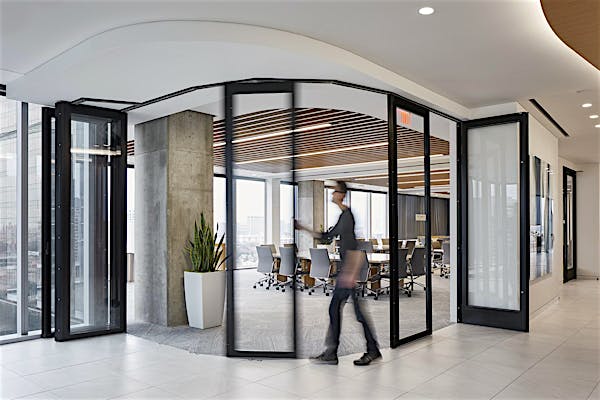
Horowitz replaced the existing drywall that closed off the master bedroom with translucent folding doors that close for privacy and quiet, but can open fully. The translucent doors connect the master bedroom to the main living space and open it to the vast city views. They also the bedroom to borrow light from the main living space.
Doors: NanaWall; door hardware: Hafele Hardware


Here are the folding doors in action. An ethereal Random Light floats over the serene master bedroom.
Wall covering: 5274 Navy, Phillip Jeffries; Random Light: LBC Lighting; Nador Bed: Ligne Roset

Perch Table Lamps: West Elm
Like the concrete coffee table in the living room, the bed floats atop a pedestal. A woven grass cloth wall covering adds texture and warmth.

Wallpaper: Pienet Kivet by Marimekko, AllModern
A bold Marimekko wallpaper enlivens the closet, which features a built-in dresser.

Before the remodel a small shower stall and an elevated bathtub divided the master bath. Horowitz combined a freestanding tub and a shower for two within the existing footprint.
“A linear drain works really well with large-format tiles,” she says. The linear drain runs along the exterior wall, and the floor is almost imperceptibly angled to drain. A clear glass splash guard and a floating vanity give the whole room an open feeling.


Sink: custom made by Bill Sheas; bathtub: Caicos B0006, Aquabrass; faucets: Hansgrohe; wall tile: RM- Greys Matt 227V in Dark Cool Grey, Creative Materials; floor tile: Tavole di Legno Ink-Jet Porcelain Tile in Walnut, Stone Source ; ceiling light: Lucifer Lighting; hardware: Hafele Hardware; OJ Wall Lamp: AmbienteDirect ; towel hook: Dornbracht
A long custom sink made of white Corian has the same type of drain as the shower. The same casework used throughout the house shows up on the vanity, as does a walnut shelf.
Team
Architecture and interior design: ZeroEnergy Design
Construction: Ralph S. Osmond
