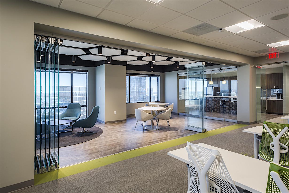
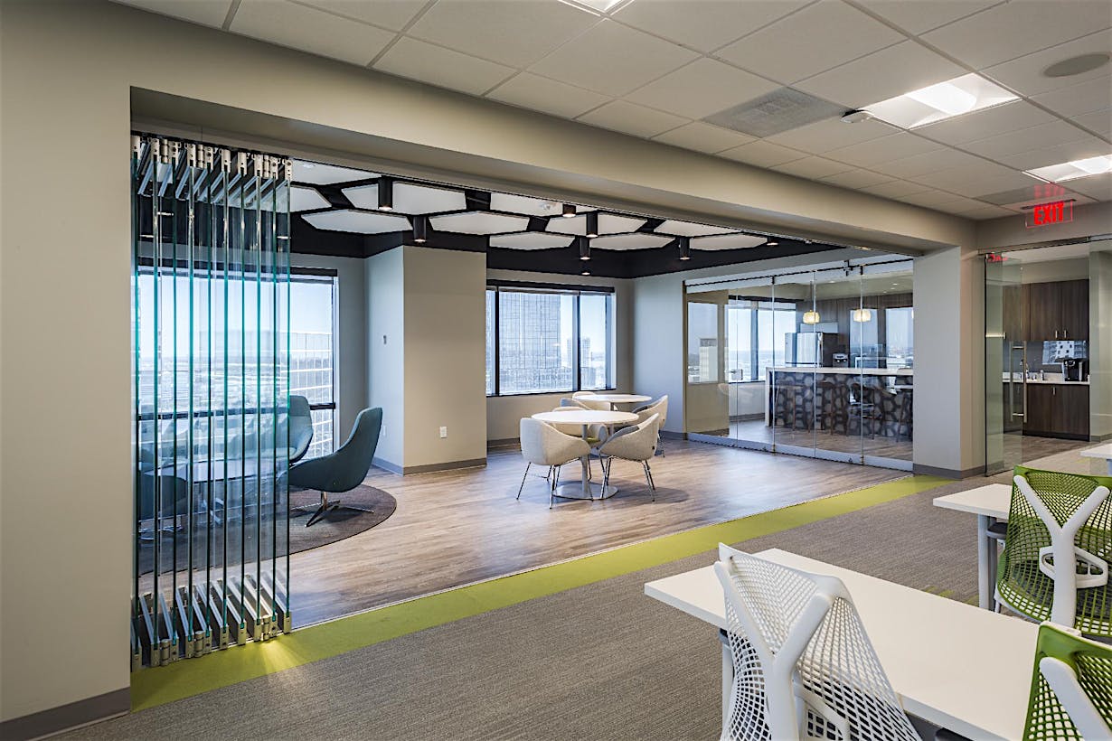
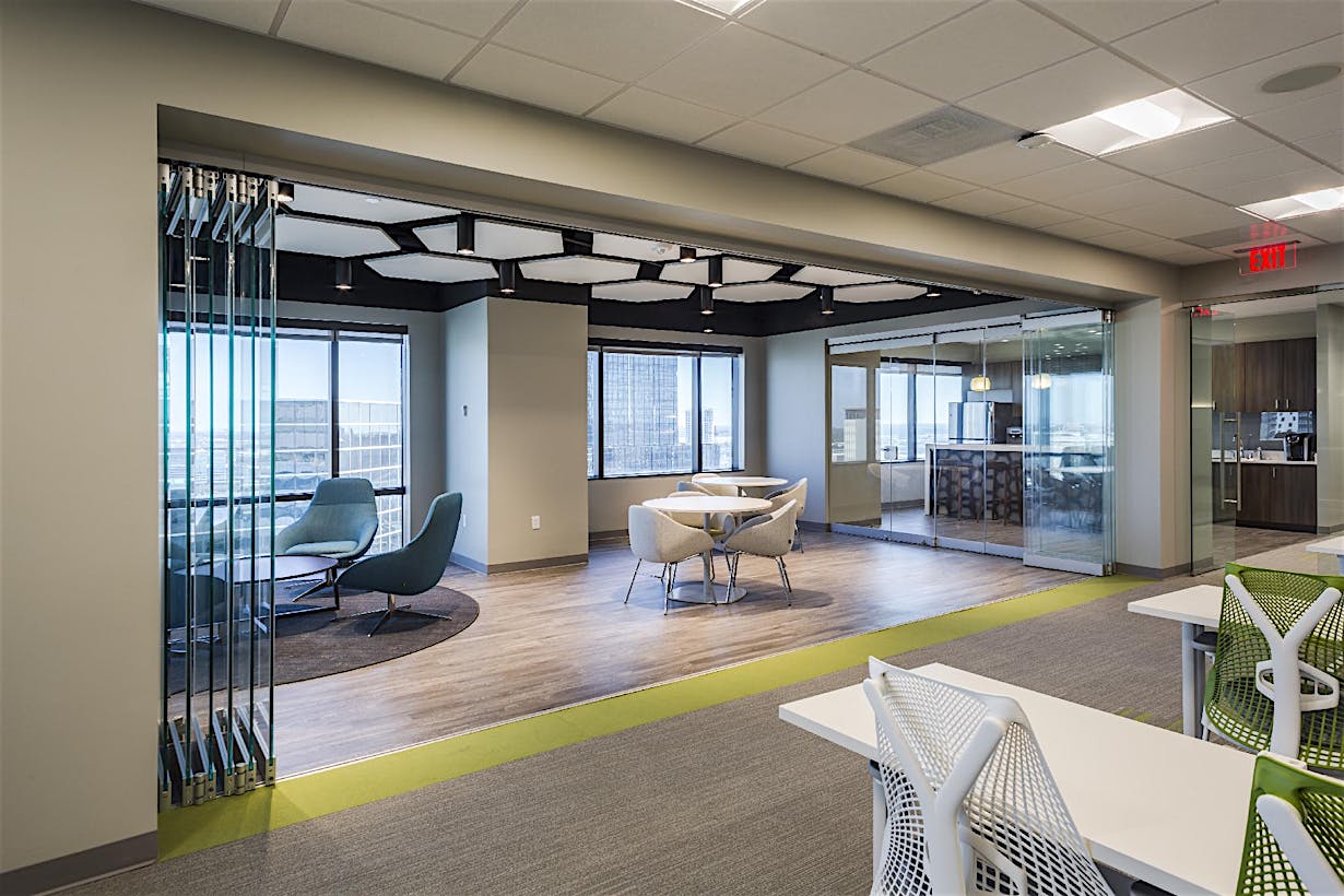
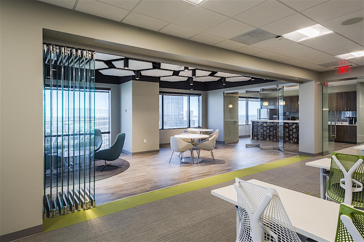
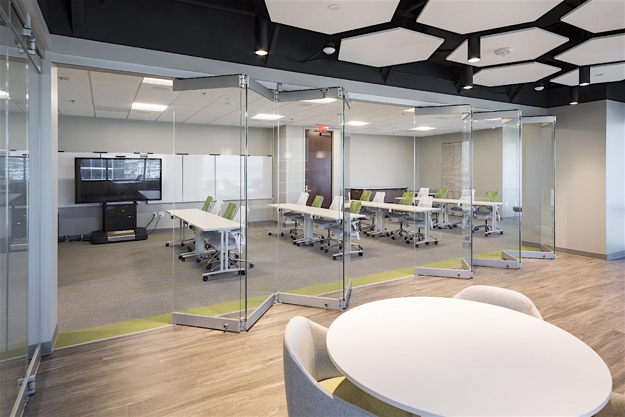
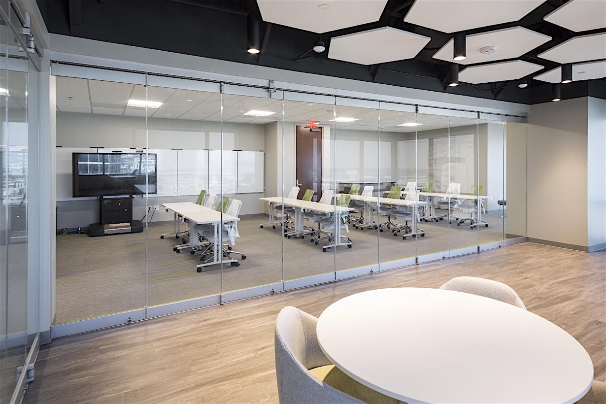
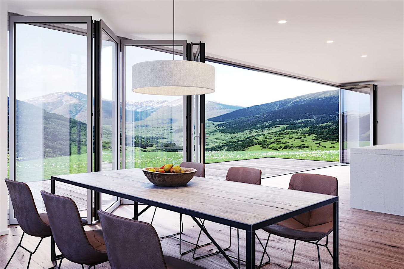
In high-rent markets, every square foot of space must deliver maximum functionality. Flexible rooms can be re-configured on demand—by opening or closing opening glass walls—to provide multiple functionalities within the same square footage, effectively multiplying the space. Visa, the global credit card payment company, maximized the utility of a new office in one of the hottest real estate markets, downtown San Francisco, by adding a cero® by NanaWall opening glass wall.
Visa One Market

Visa Innovation Center

Visa, which is headquartered in Foster City, CA has been increasing its corporate presence in San Francisco, and as such, been rebranding its own aesthetic to appear more like that of a tech company. Visa recently took over a new floor of the building on Market Street where it leases its offices, and engaged international architecture firm, Gensler to take on its design.
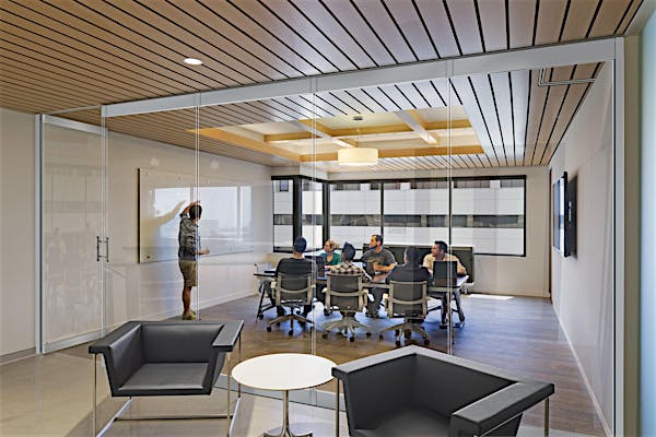
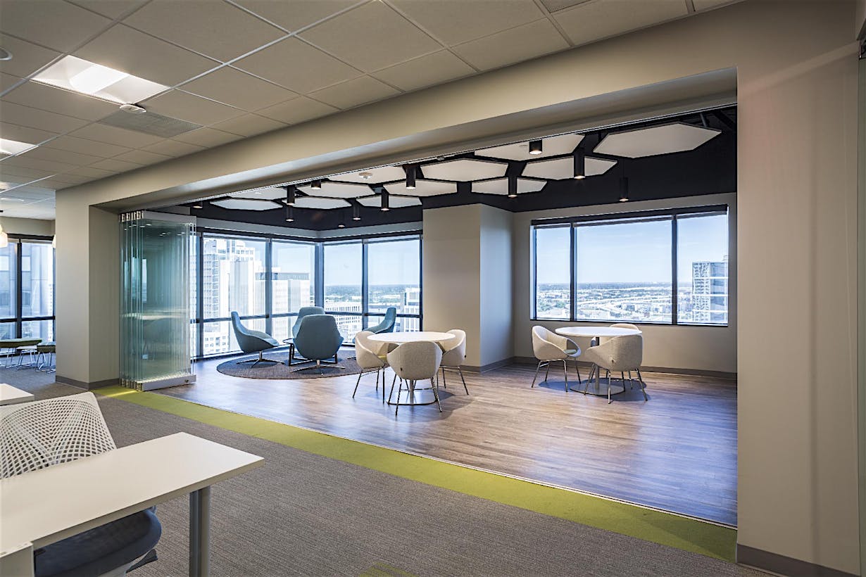
The new floor, which has a relatively small floorplate, is split in halves. One side is additional office space. The side facing the bay is a suite of executive conference rooms that take advantage of the sweeping views, including a large boardroom and two smaller conference rooms.
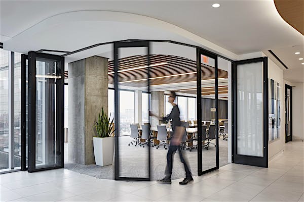
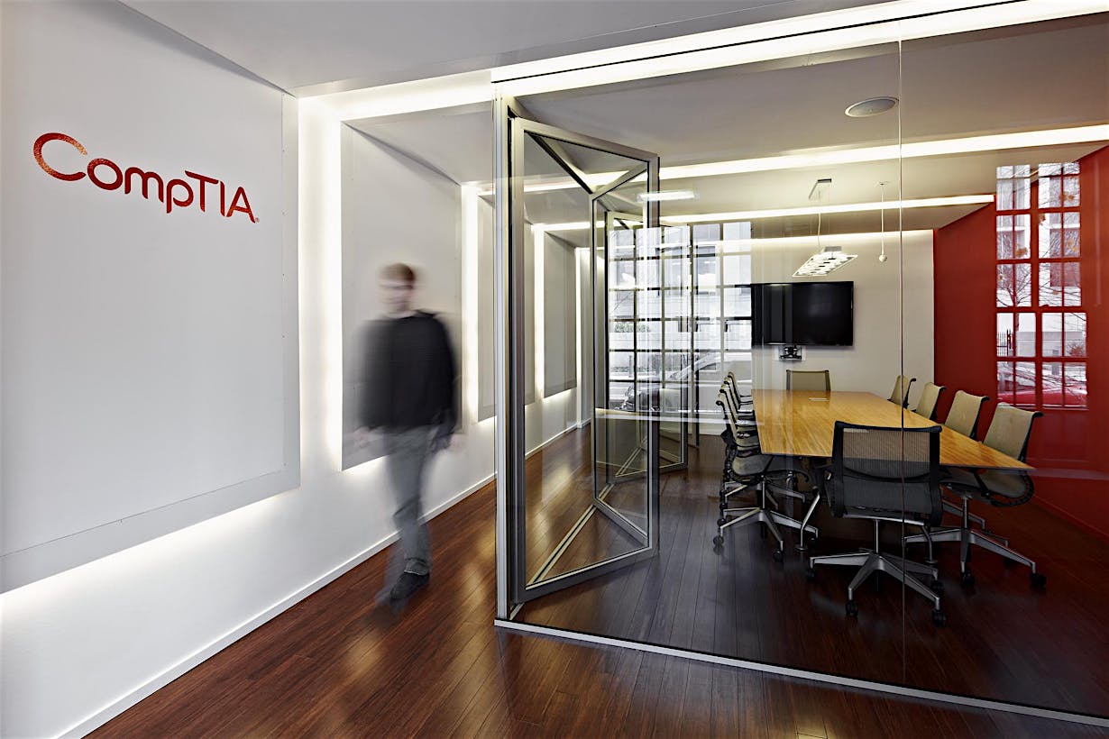
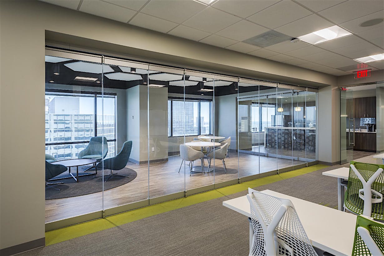
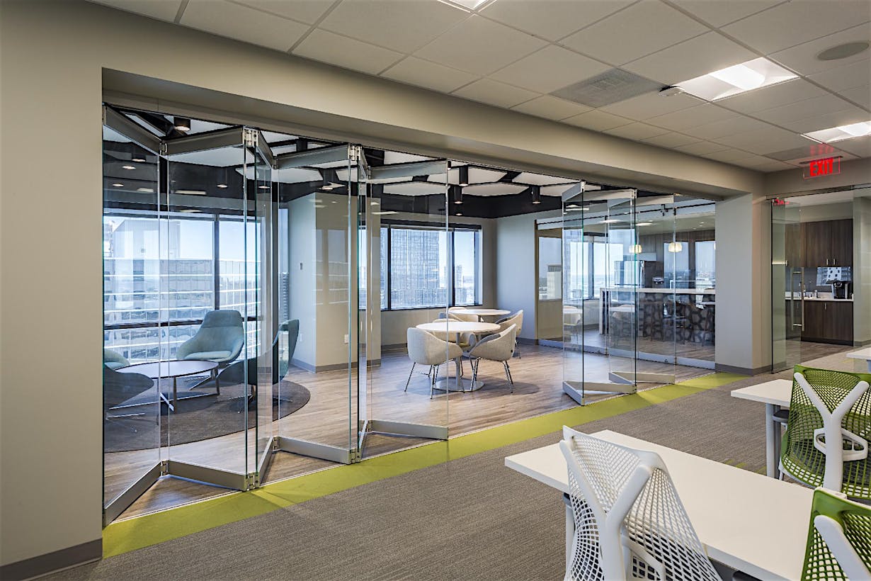
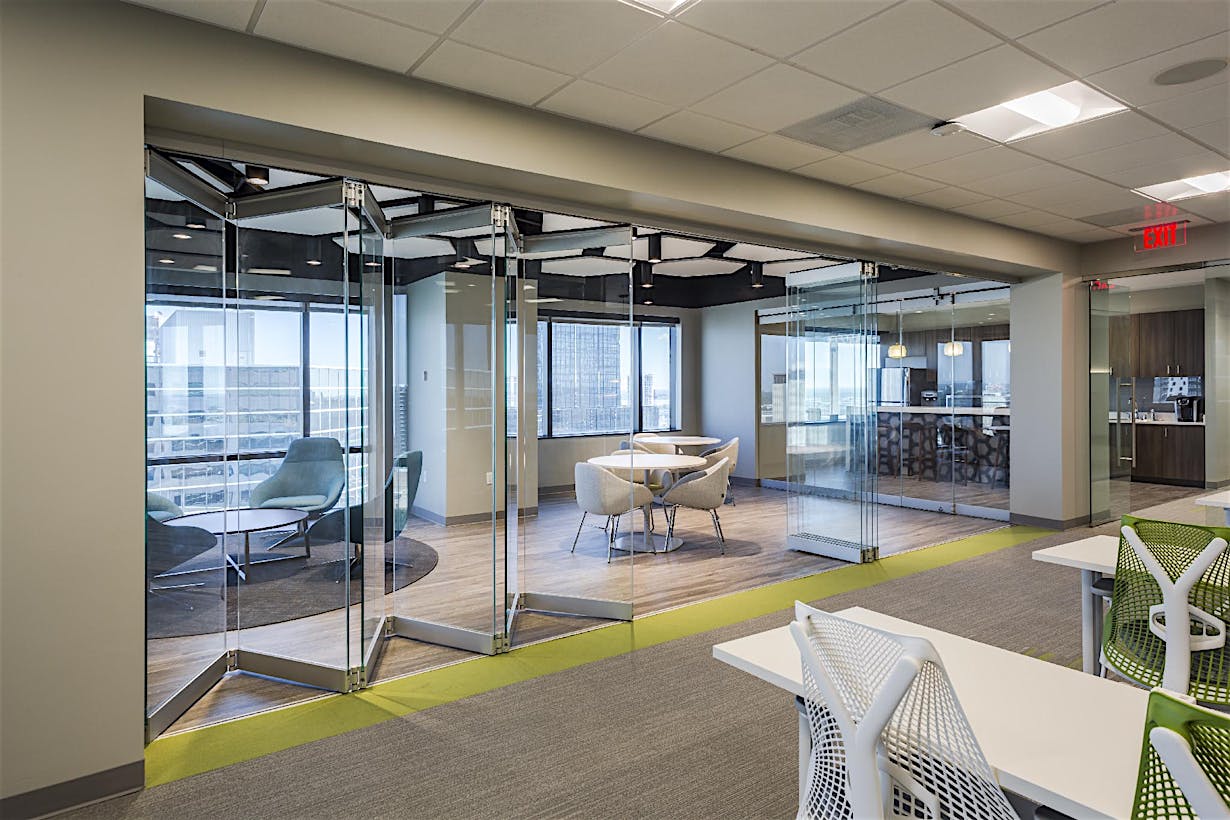
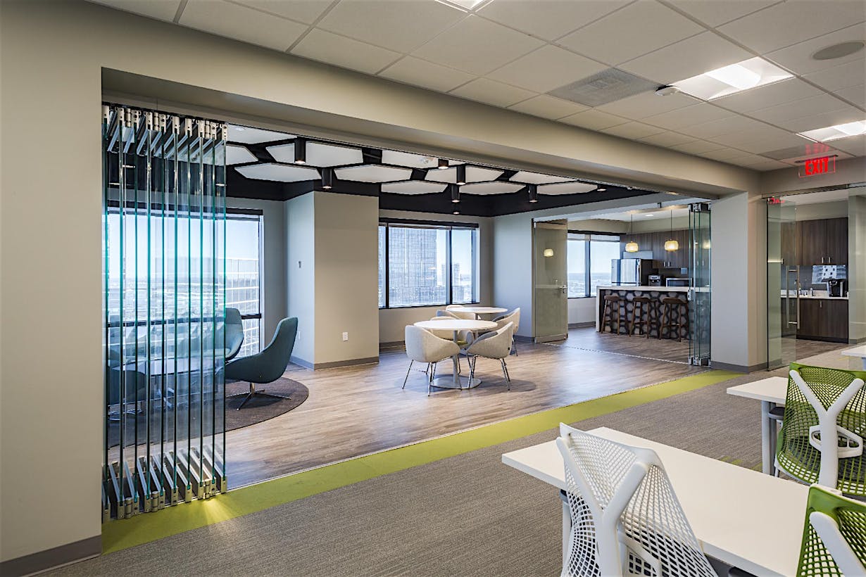
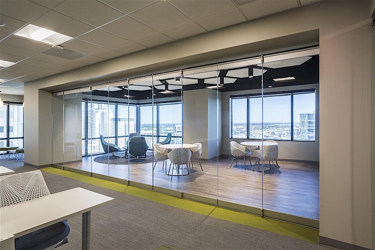
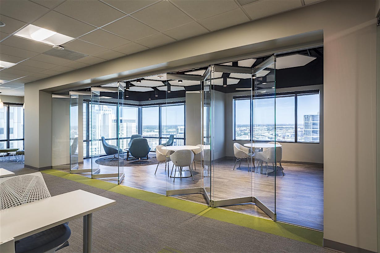
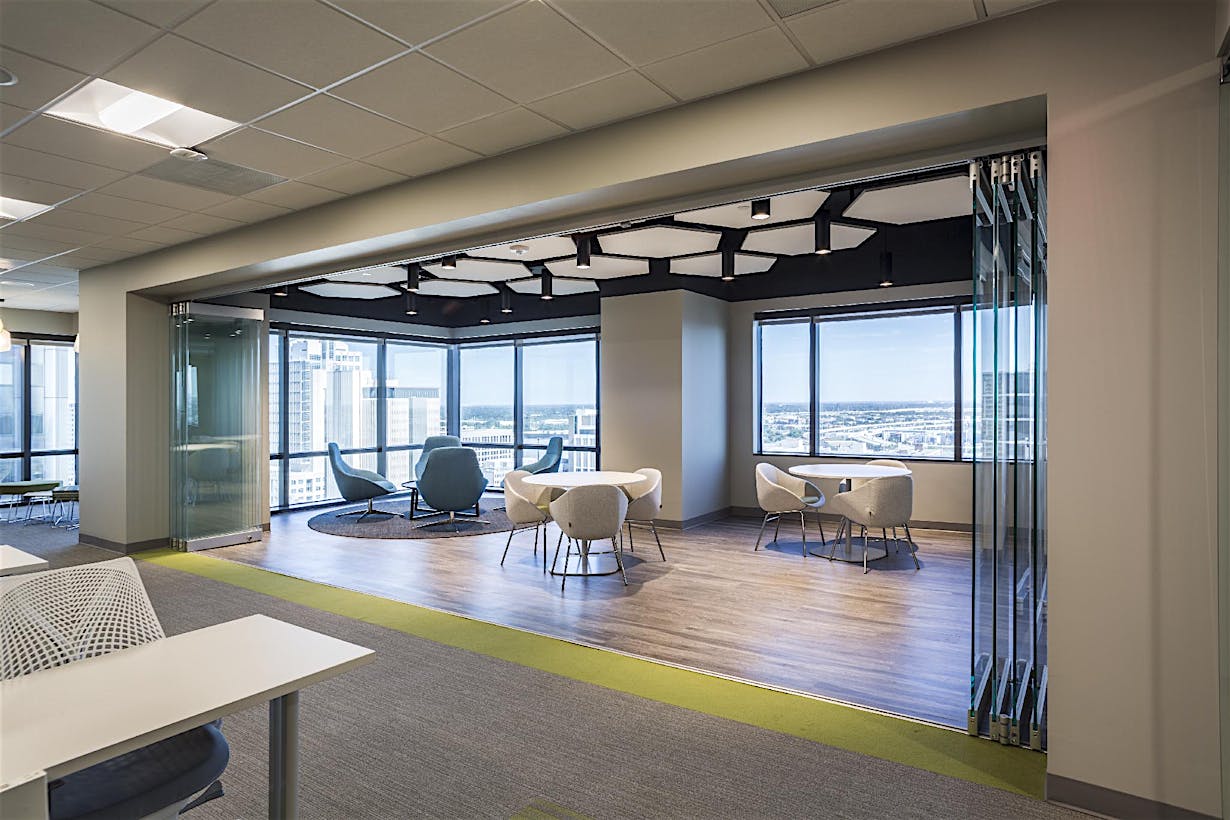
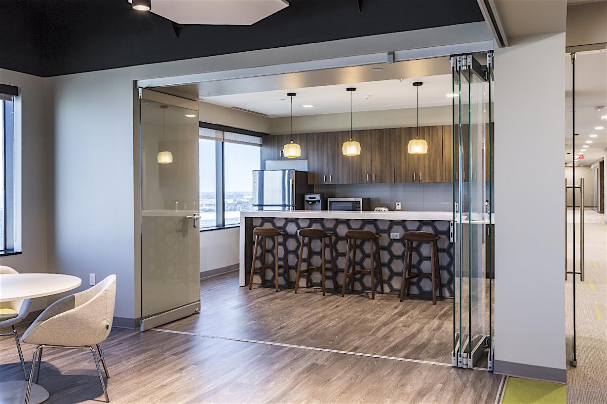
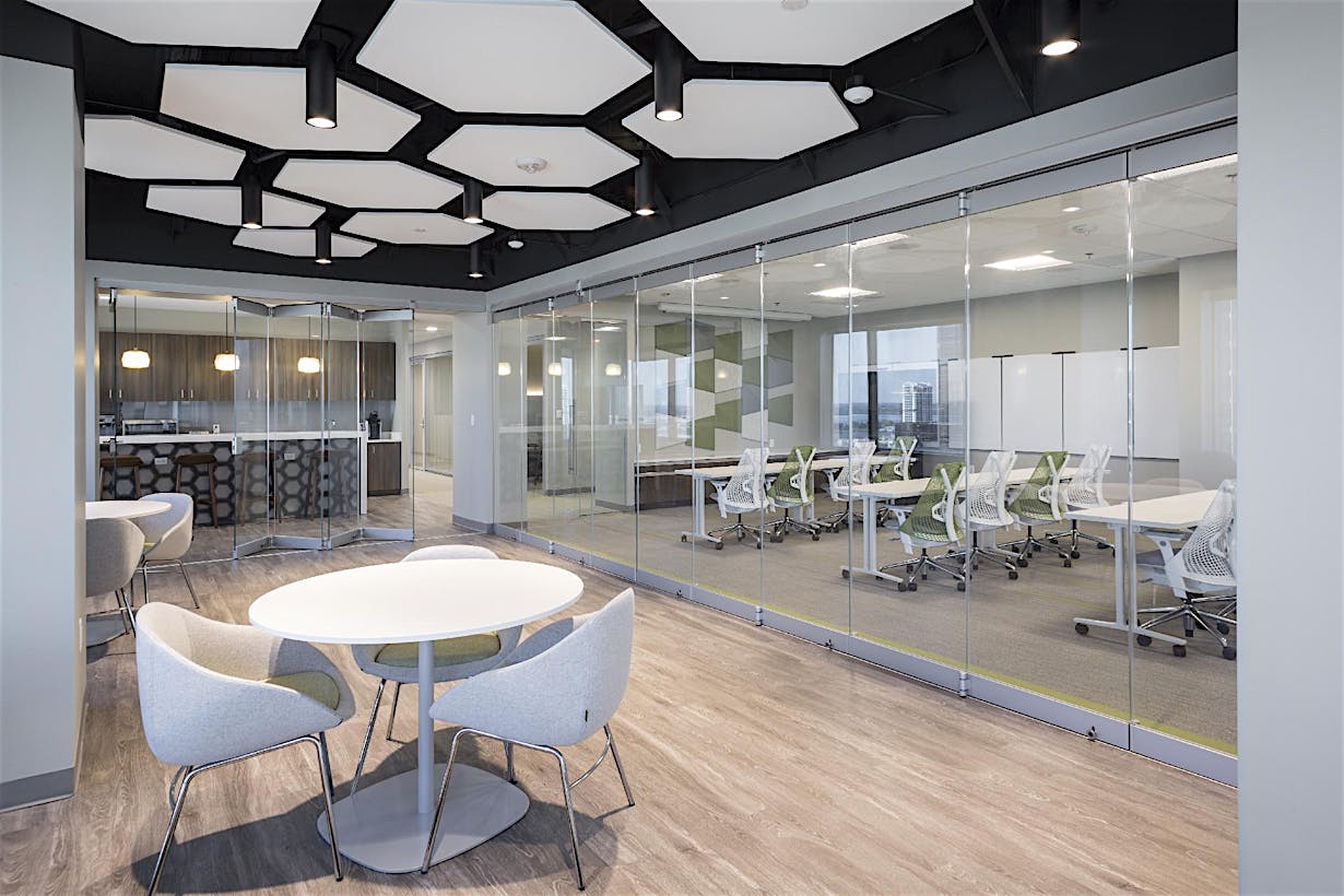
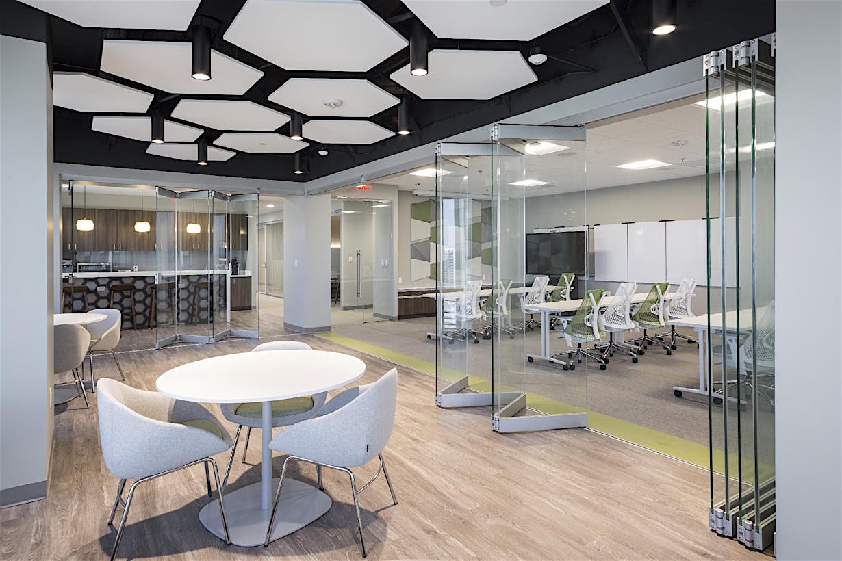
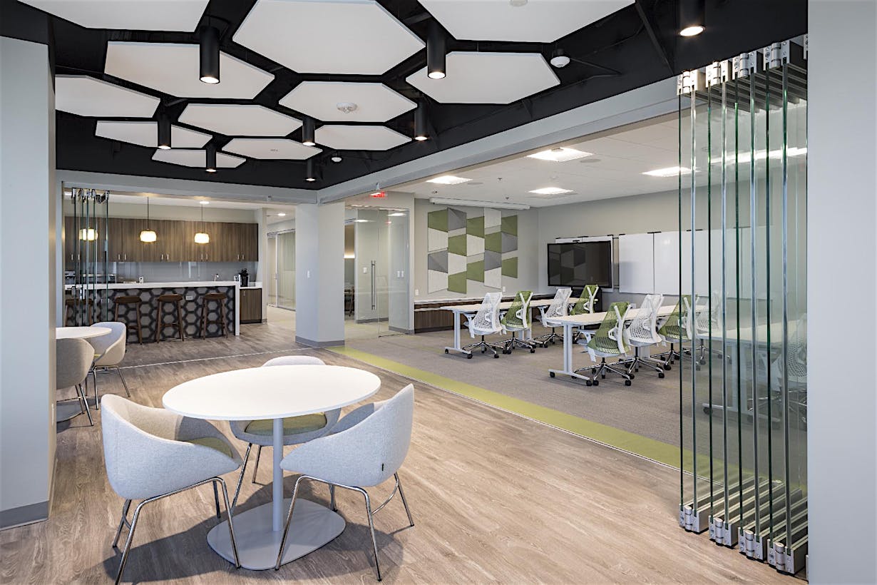
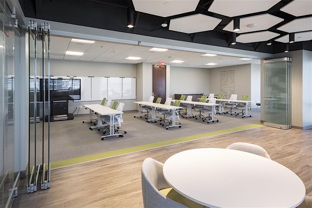
The area between the conference rooms is intended as social event space that can be used for breakout space during boardroom meetings. To maximize utility, one of the conference rooms can be joined onto the social area by opening a NanaWall cero opening glass wall.
“The NanaWall opening glass wall allows for more events, dining functions, and social functions to take place.”
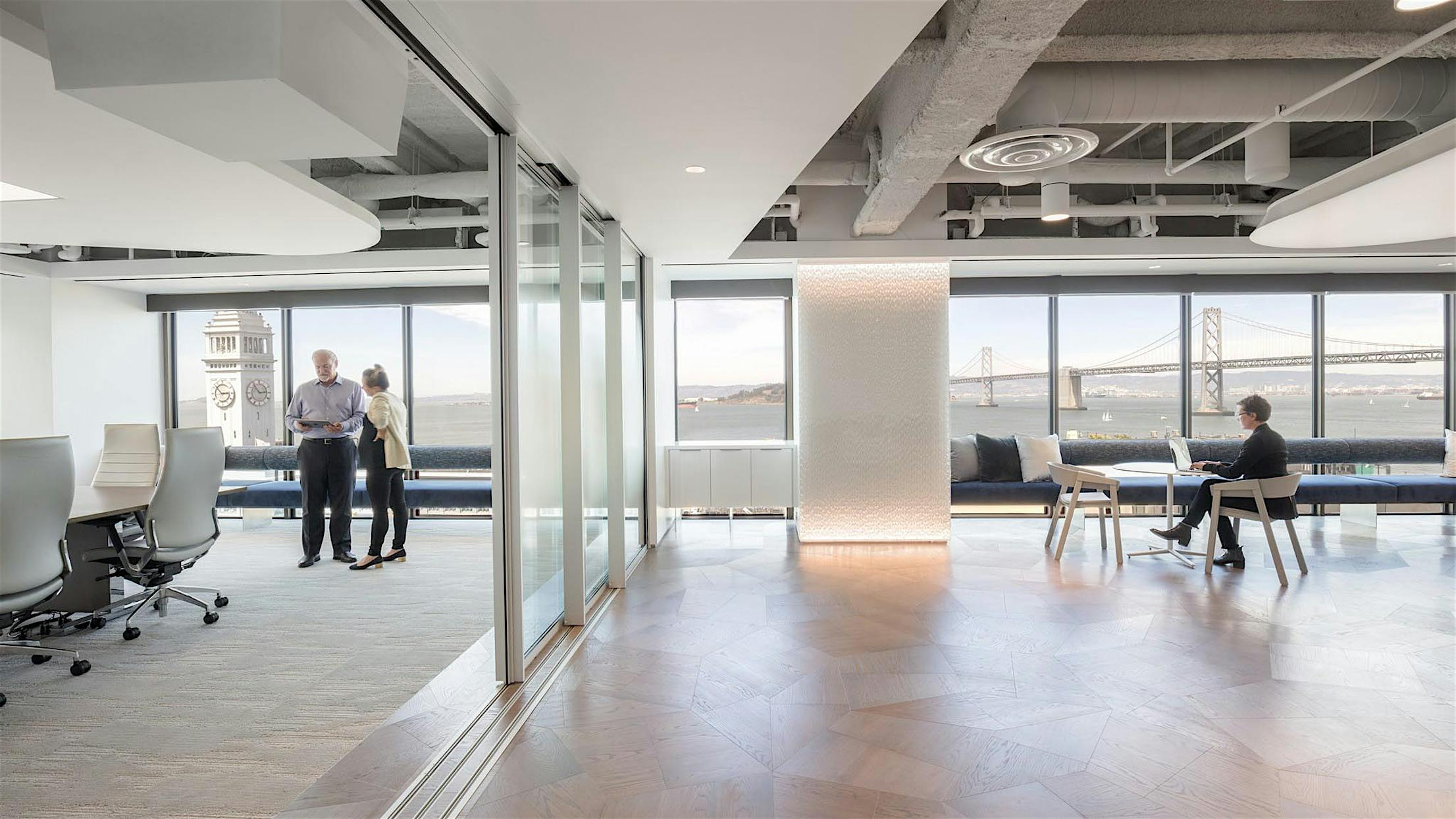

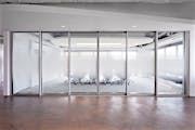
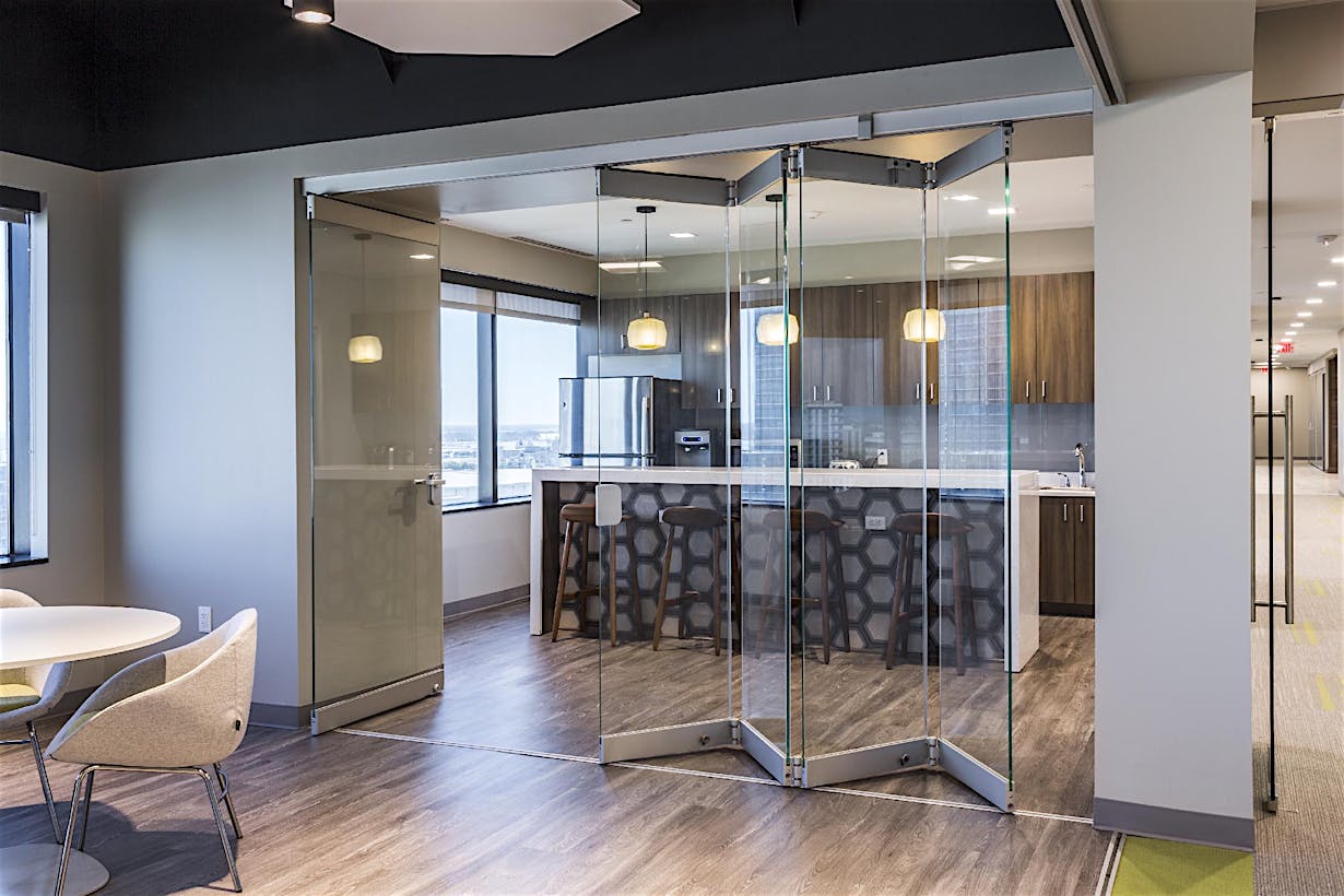
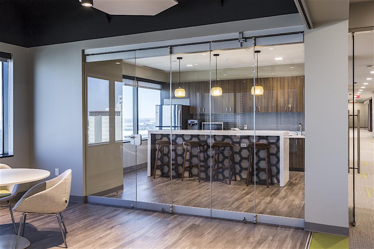
cero® is a minimally framed system with a flush floor track and large panes of glass, thereby allowing maximum light transmission and visual openness. Visa’s cero wall is 23′6″ wide, consisting of six panels that slide easily outward from the center. "We selected cero® for its clean lines and simple, minimal frame around the glass, and because of the center-opening option with no need for a closet or pocket for the doors to nest," O’Rear explains. "We wanted the ‘center fold’ because we didn’t have a lot of room on either side to stack walls." The central areas of the glass panels were fitted with a frosted film that provides visual privacy for meetings, but still passes full daylight illumination through the wall.

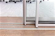
Gensler took advantage of cero’s flush sill track to make it even more "disappearing" than usual by using inserts of the finish flooring between the tracks. The sill, which is virtually unnoticeable in terms of foot feel, visually vanishes at most viewing distances, completing the seamless aesthetic when the wall is opened.
cero® is our maximally paned, minimally framed opening glass wall system. Cero’s expansive glass panes allow for maximum light transmission, while its flush floor track with finish flooring inserts minimizes visual disturbance and delineation of adjoined spaces when the system is ajar. The pairing of cero® minimal glass wall and the minimal flush sill can yield an impressive STC rating of 43.
The space presented a design challenge because of the building’s three-foot deep structural ceiling beams, leaving just 9′6″ of clearance. Most of the ceilings are left open and the floating clouds of stretched fabric provide acoustical control. The movable wall is 8′6″ high, and the custom panel widths are perfectly proportioned and convey a feeling of spaciousness.
"Knowing that we needed to provide a space that would function every day of the week for different groups drove the design," explains Gensler Design Director Melissa O’Rear.
