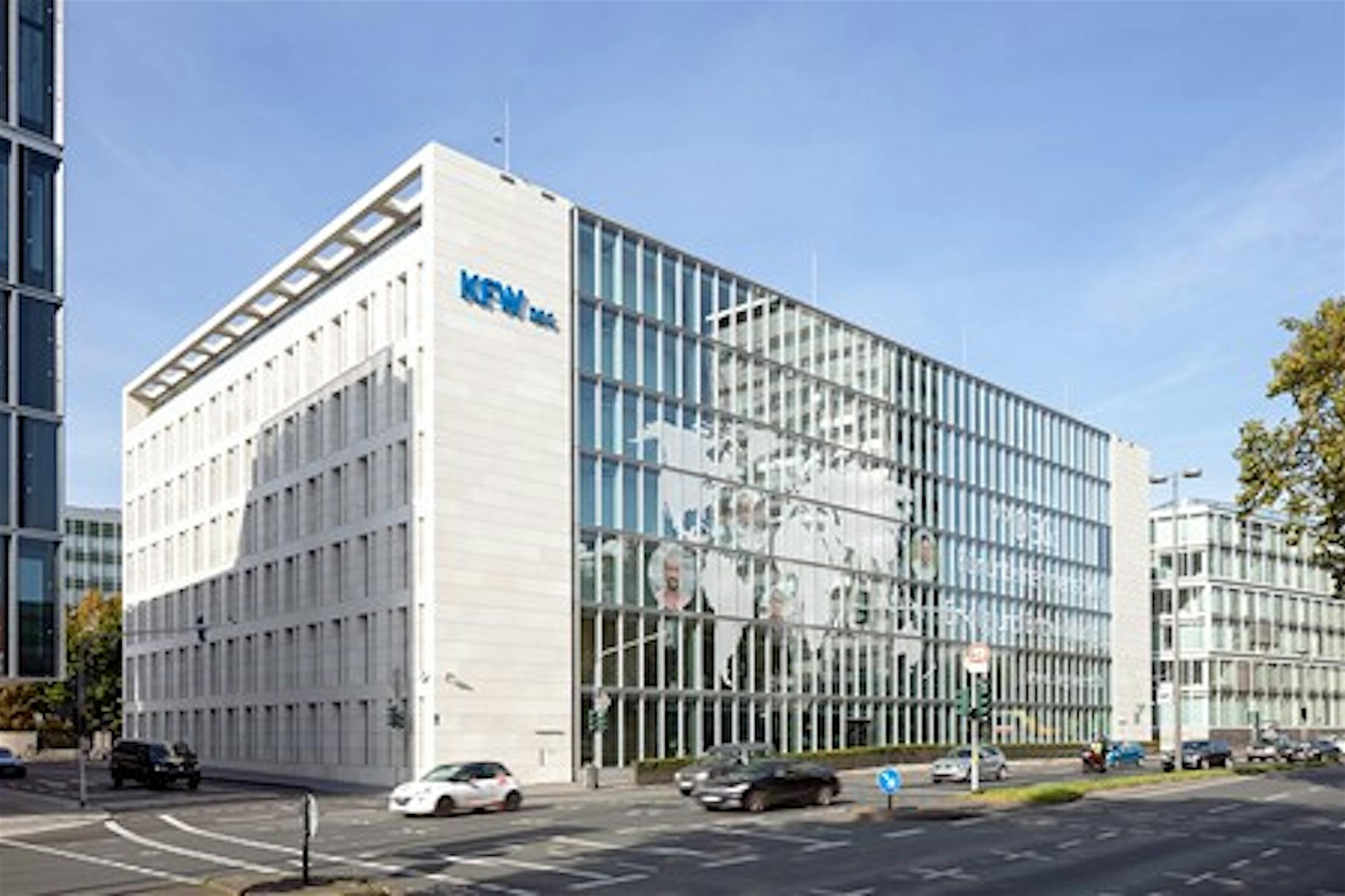
In 2008, DEG—an international investment and development company—built its new headquarters in Cologne, Germany. The 7-story 30,000 square foot building received high acclaim due to its contemporary and sustainable construction. But, it is not what is seen from the exterior of the building that received the most accolades. Within the interior sits a centrally located atrium that fills the offices with an abundance of natural daylight. Sitting atop this atrium is a convertible glass roof which, on demand, exposes or covers the atrium to open air.
DEG Headquarters
The Cloud within DEG Headquarters
Need to Maximize Usable Space
In 2011, DEG determined a need to enlarge their offices into a campus and brought forth a competition to design an annex building adjacent to the 2008 headquarters. Furthermore, they had a goal to expand the useable square footage within the original building. Düsseldorf firm, sop (slapa oberholz pszczulny) architectscreated the winning design. This firm artfully designed an all glass façade modern building that bridges to the original sandstone and glass building. Now these adjoined buildings house some 500 employees.
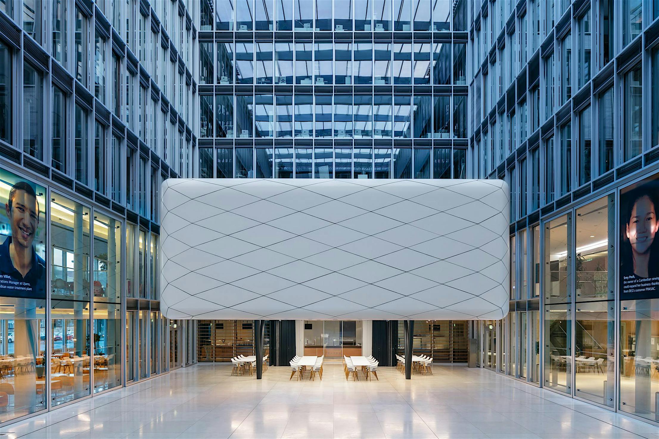
In addition to the new annex building, sop architects designed a truly captivating solution to the need of expanding the flexible footprint of usable space in the original headquarters building. Architect Jochen Solbach and the sop team created a kinetic-like sculptural pavilion within the convertible glass roofed atrium. Playing with the sense of translucency, nature, light, and air, now sits a floating “Cloud”.
Creating a Room-within-a-Room on Demand
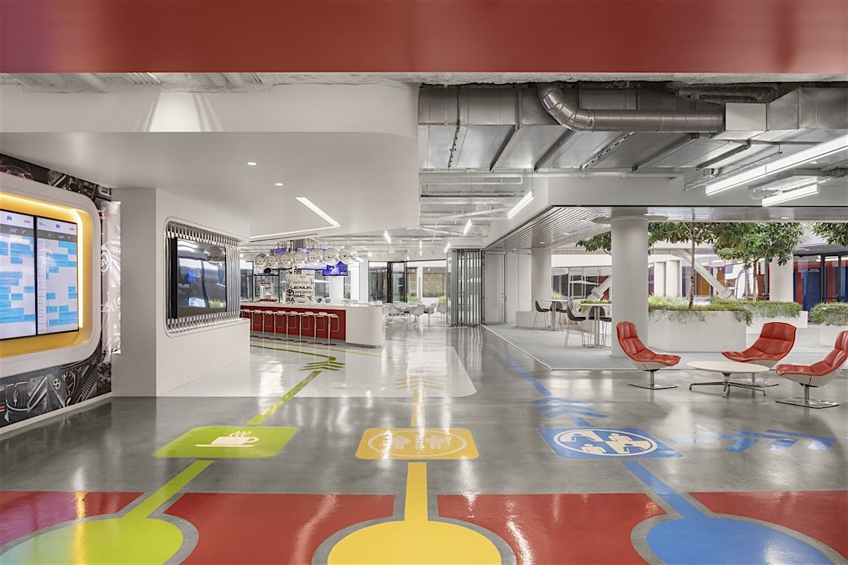
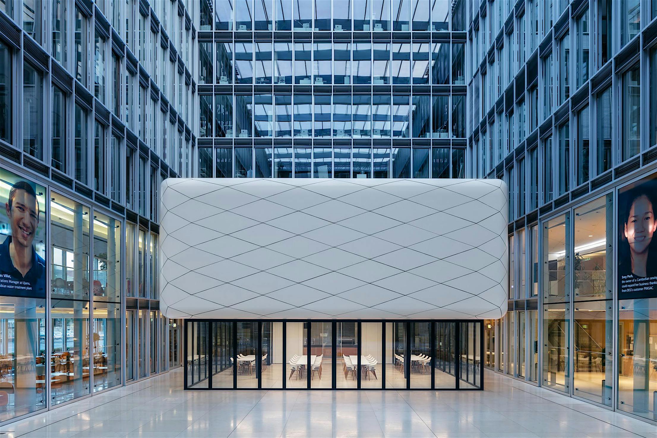
Completed in 2018, the newly redesigned open space serves as an open or closed event and break room for the employees of DEG. The convertible glass roof is opened on a regular basis in pleasant weather and transforms the atrium into an airy courtyard. Yet, in order to gain flexible sheltered space for the workforce, the architectural firm embraced a room-within-a-room concept to add the much-needed year-round functional space. "Our idea was to extend the existing cafeteria with another room in the atrium, with a dividable conference room [built overhead] - all integrated into an object that looks like a sculpture in the surroundings," says architect Solbach.
The Floating Cloud
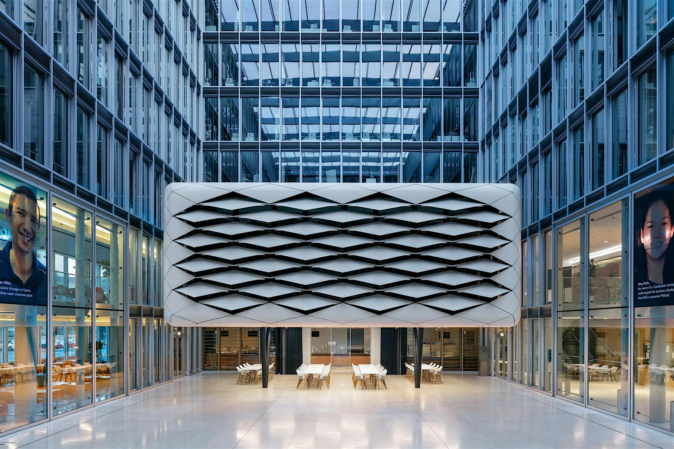
To accomplish this, the two-story floating “Cloud” is constructed of diamond patterned white skin on three sides with the fourth side being attached to the office interior. This lamella design consists of a crisscrossing of parallelograms that are hinged together to form a connected web of movable fins. These operable fins not only give the “Cloud” its kinetic appearance but they also provide natural light and transparency or closed-off privacy in the elevated conference room as needed. This cloud-like component protects the transparently glazed conference room from the outdoor elements when the glass roof is open.
The HSW Systems Solution
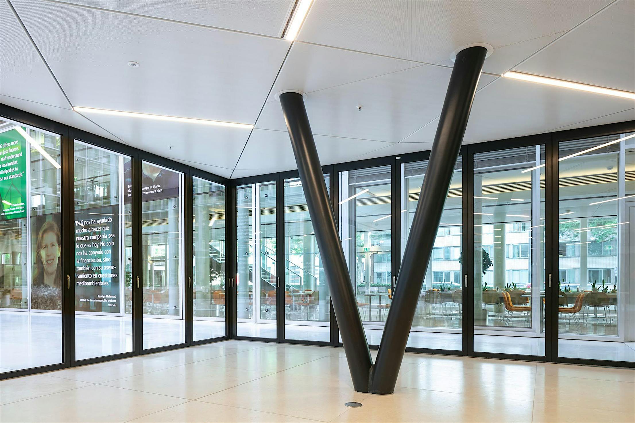
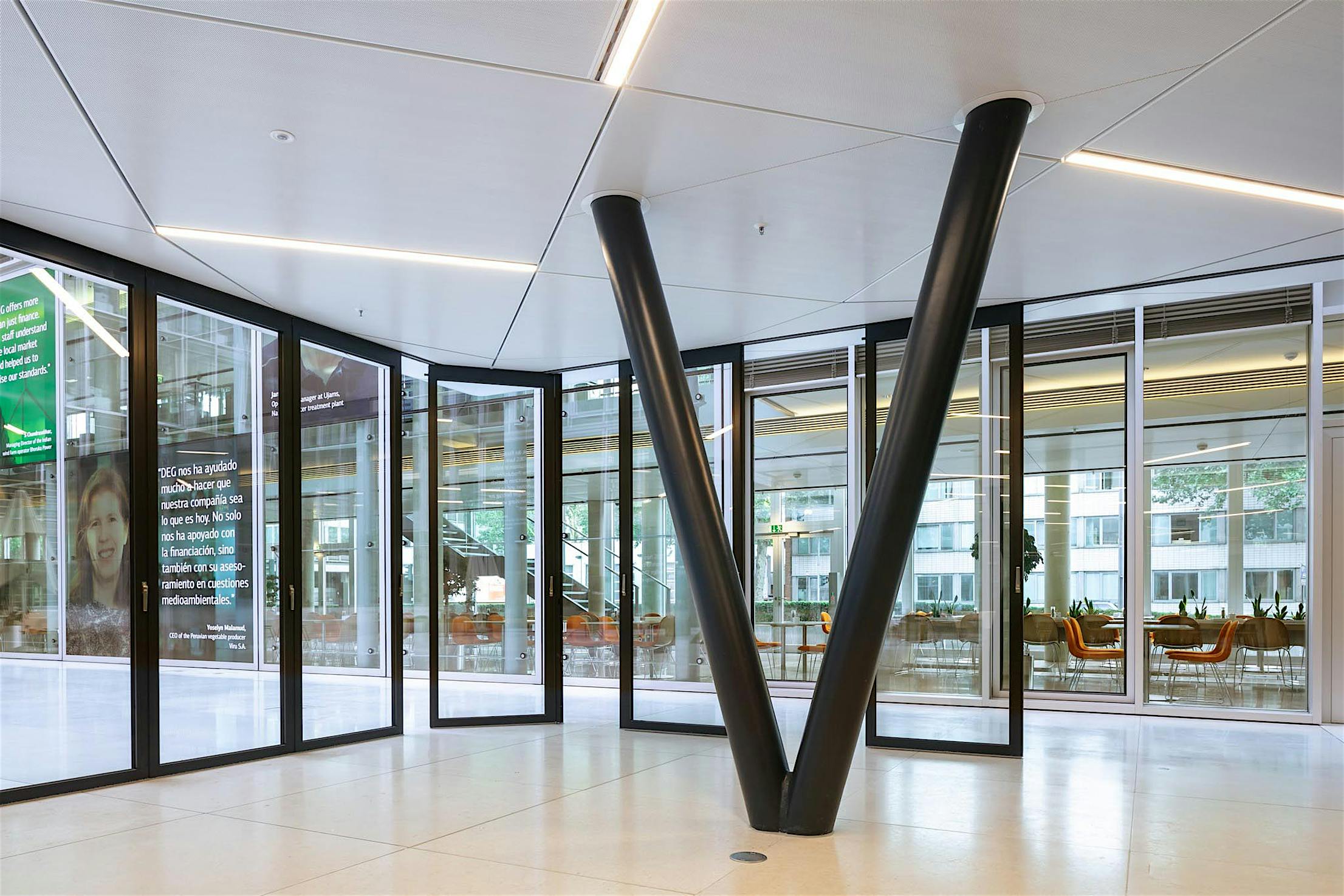
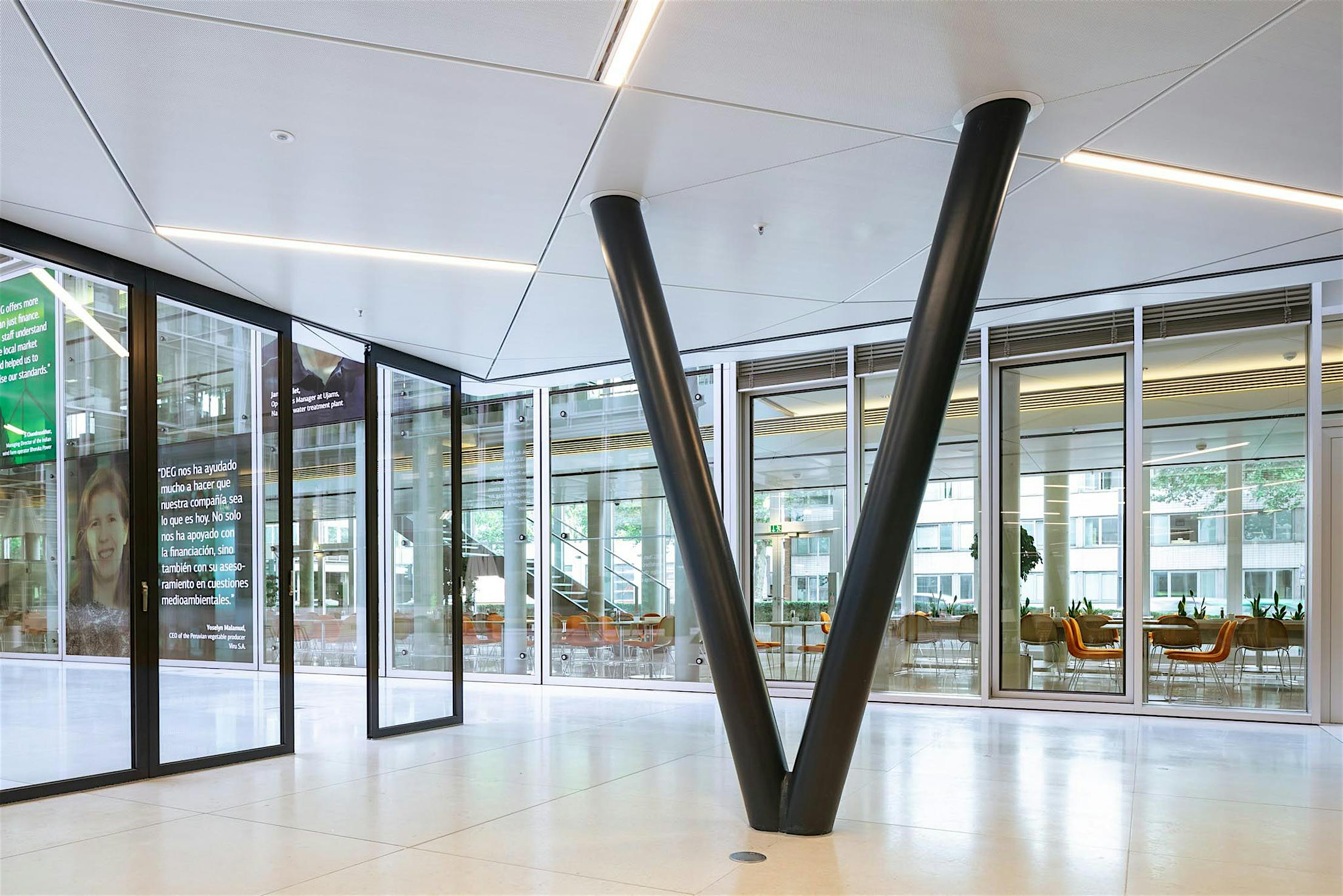
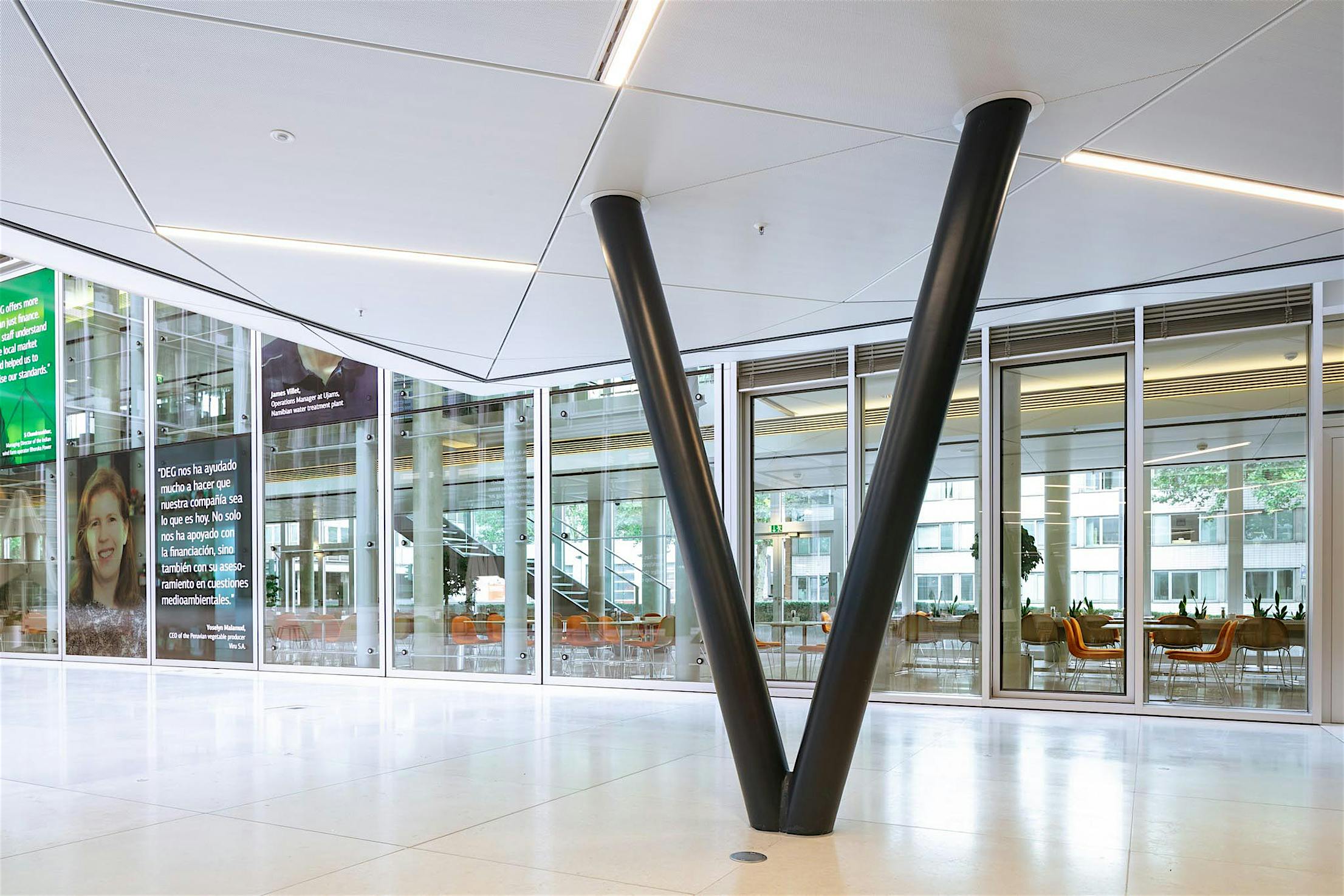
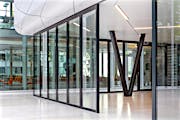
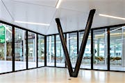
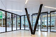
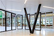
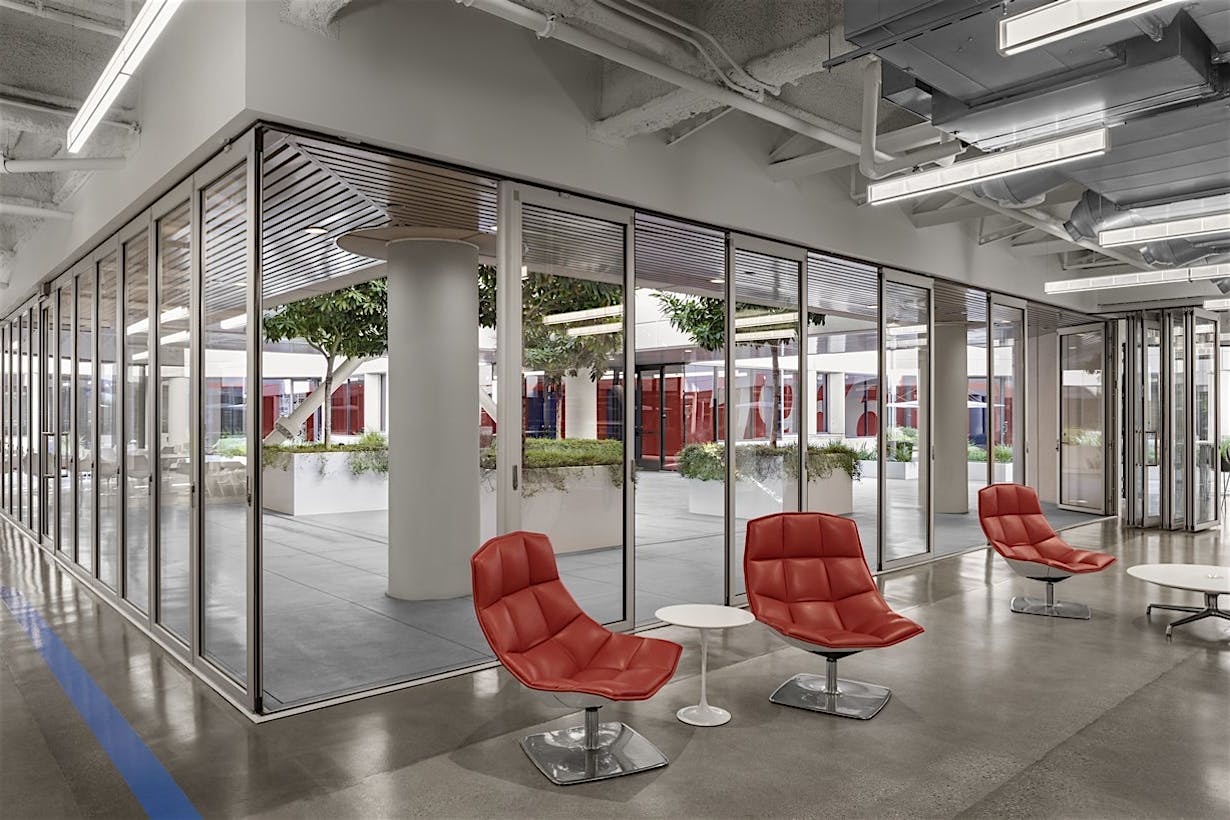
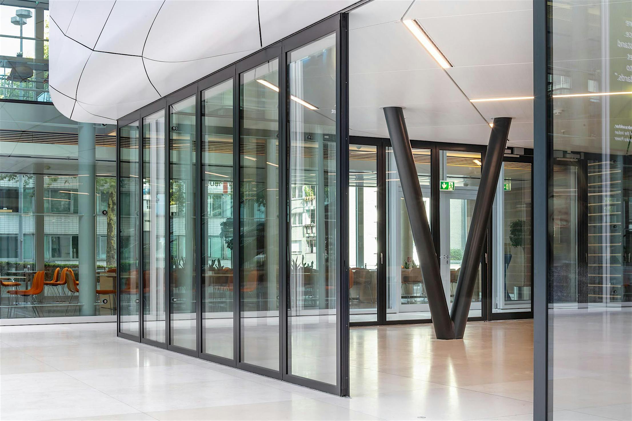
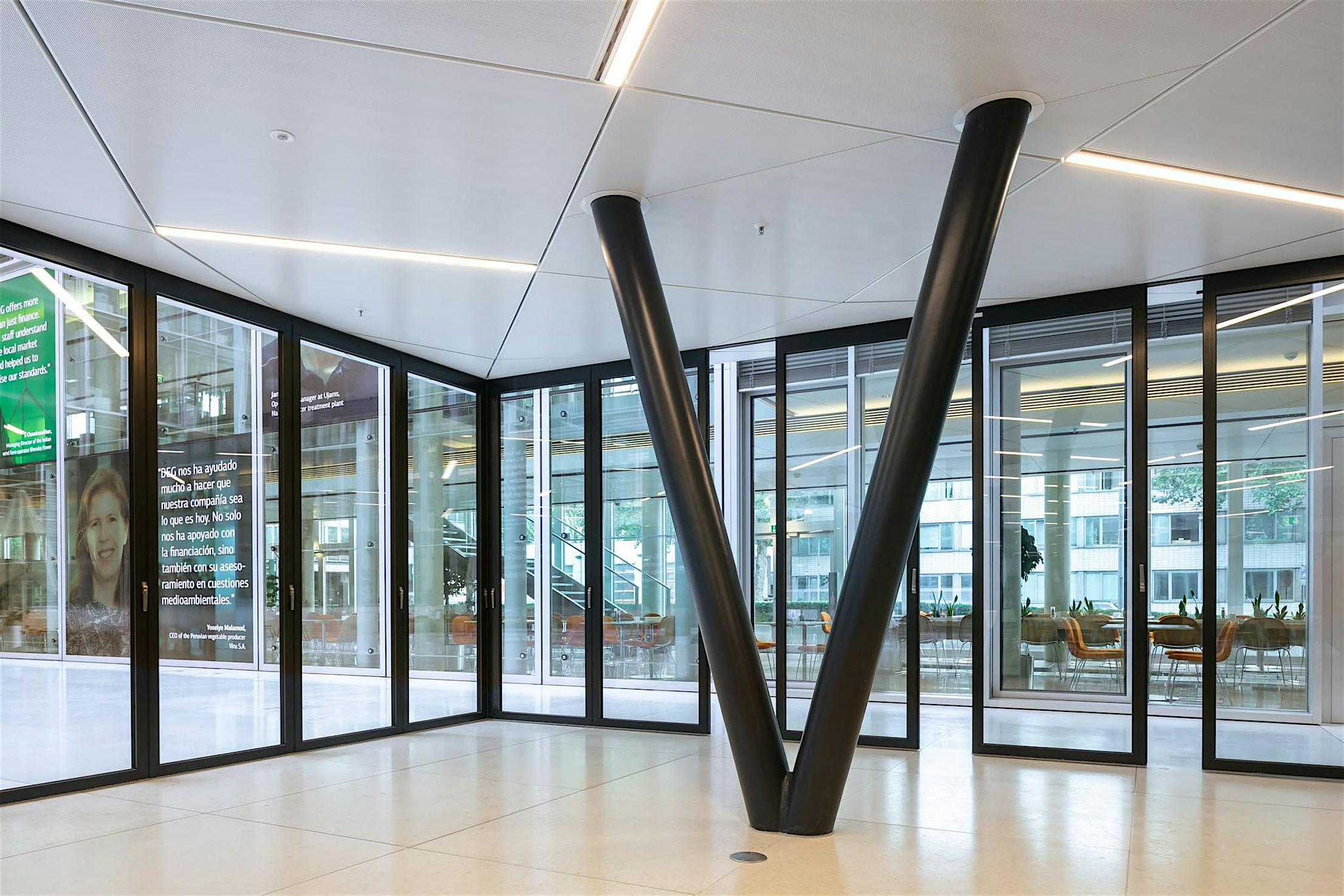
To achieve the levitating appearance of the “Cloud”, V-shaped structural supports are used and the need for structural columns at the corners was negated. This recessed V-support system truly gives the illusion of flotation to the covered conference room as if it were a “Cloud”. Moreover, this is further enhanced by the product chosen to enclose the flexible break room space on the ground floor, an HSW60 single track stacking glass door system. The manufacturer of the glass wall system, Solarlux, is the German partner of USA-based NanaWall Systems.
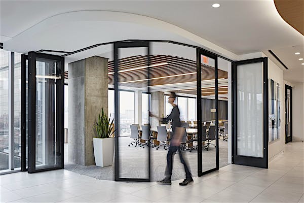
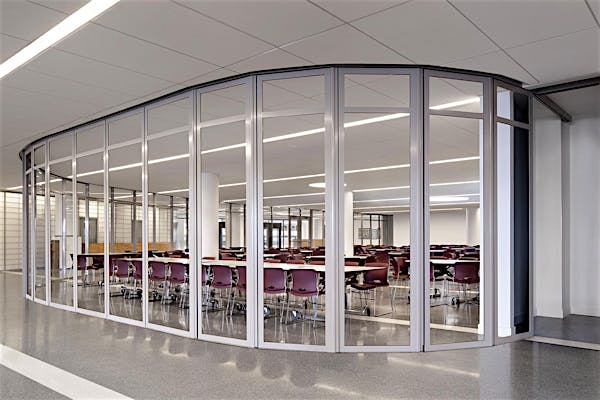
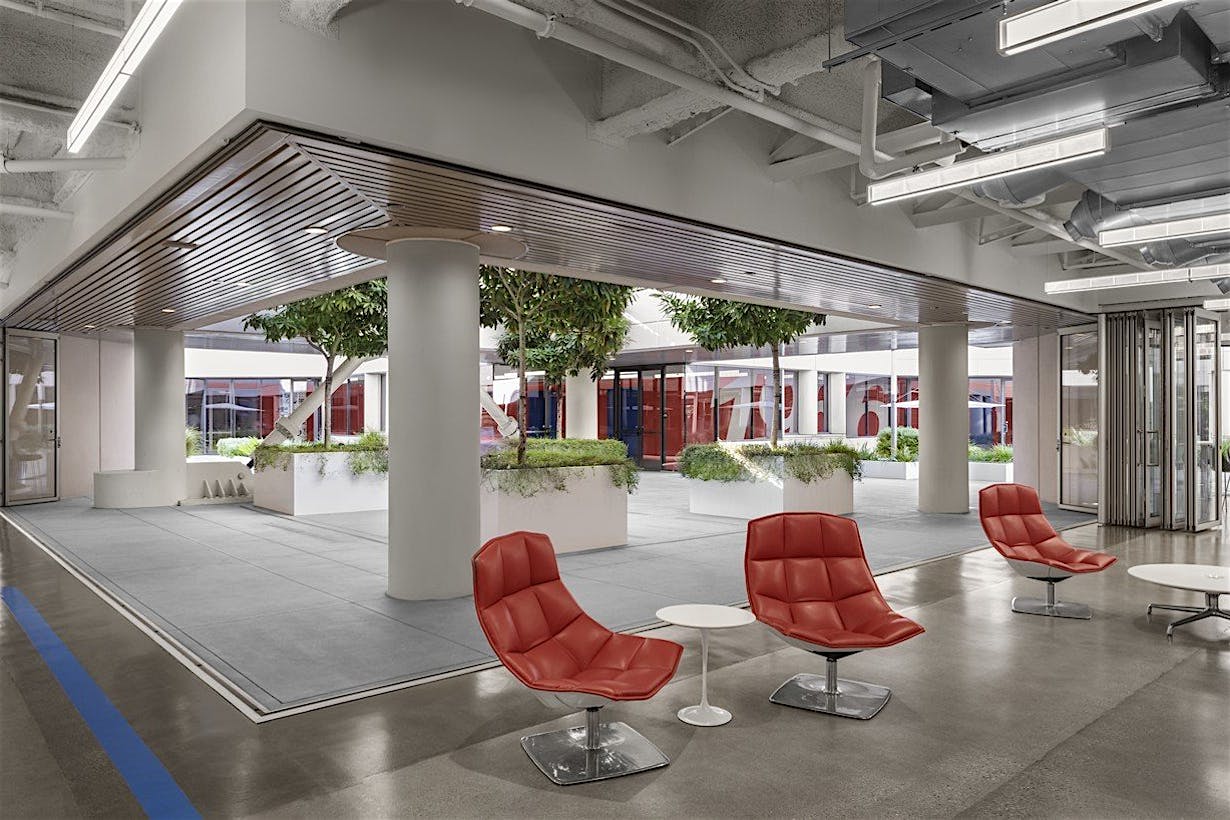
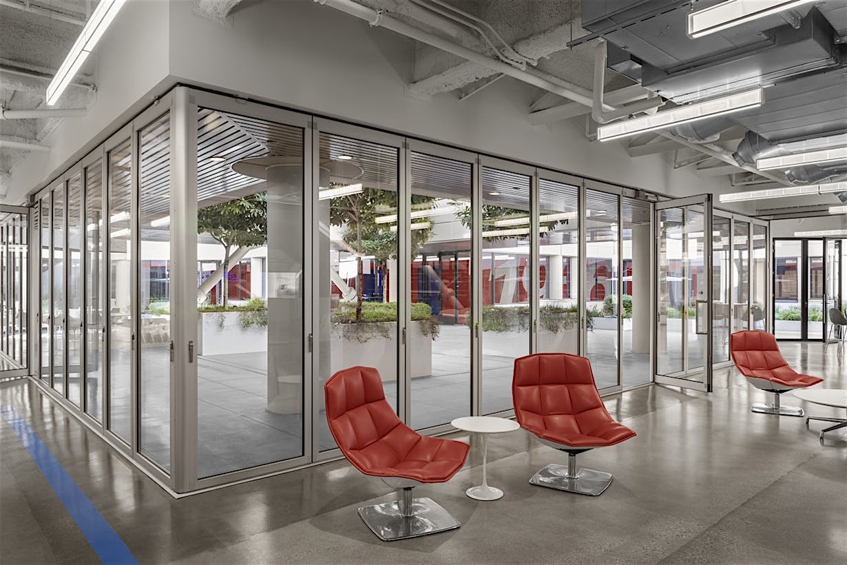
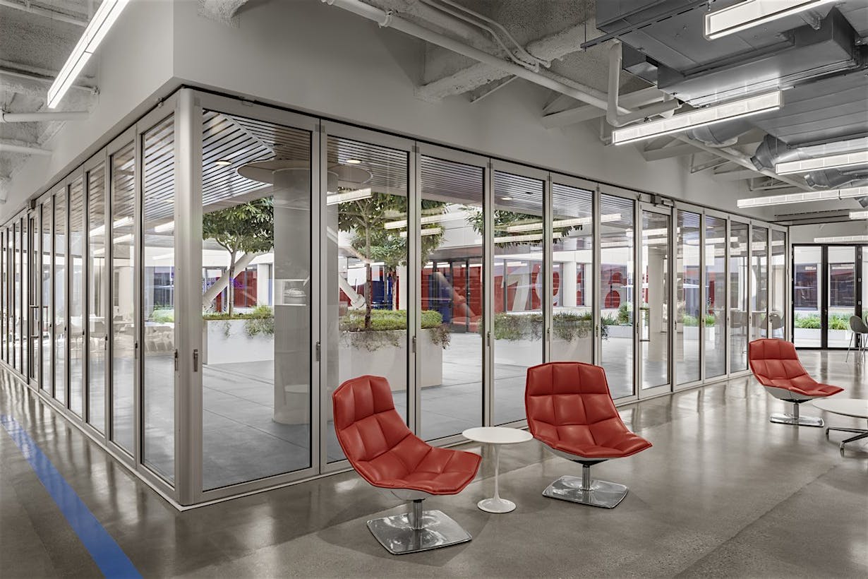
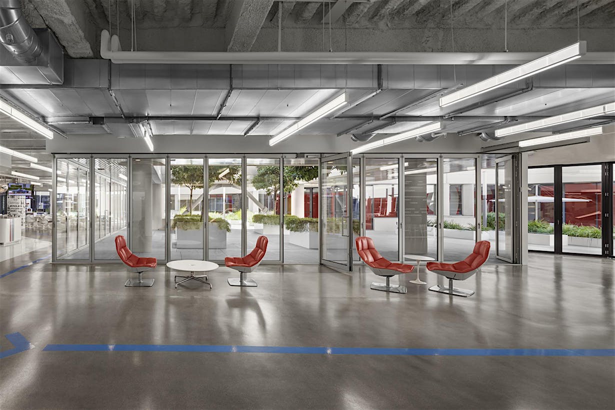
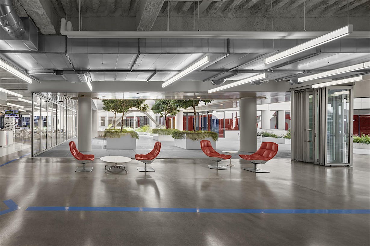
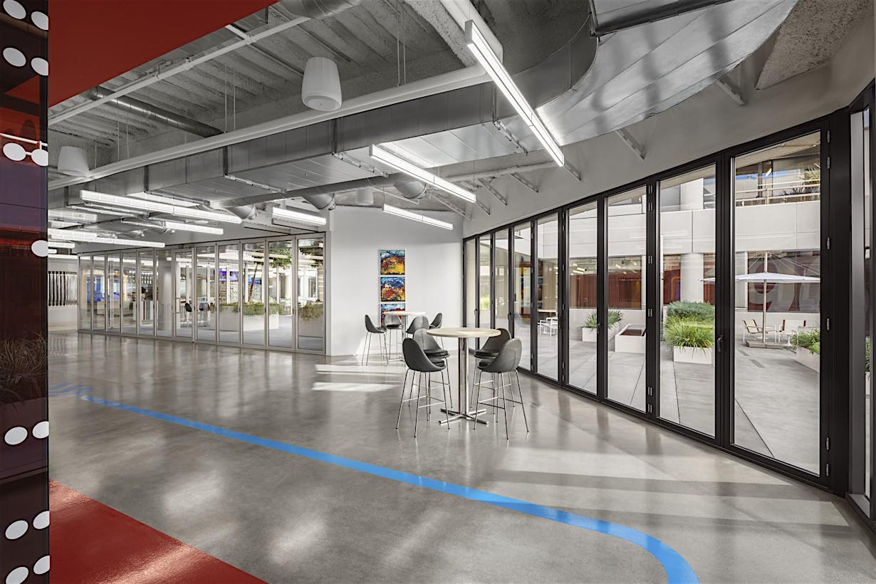
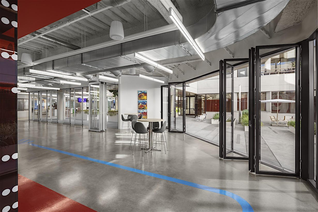
As with the “Cloud” above, the HSW60 is a three-sided operable system that completely disappears when open. Because of the unique features of the opening glass wall, the HSW60 is able to create an open corner design on two sides. With the vertical profile design of the HSW60, the system echoes the existing façade grid of the building’s exterior shell and stylistically blends in as if it were part of the original building design.
Open Corner Design
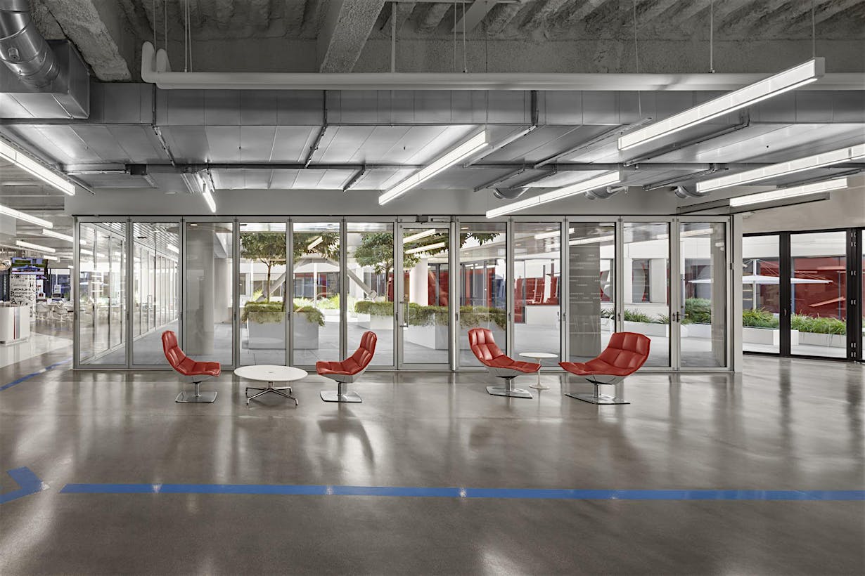
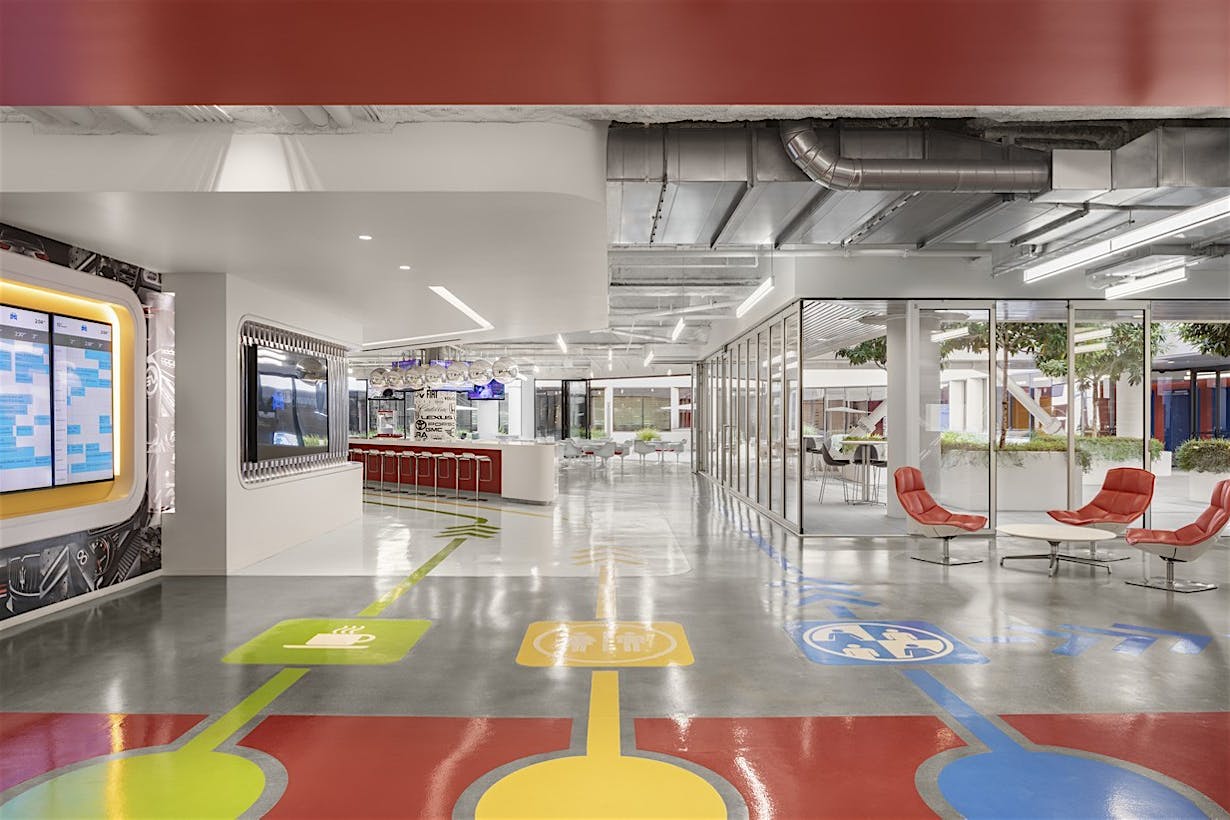
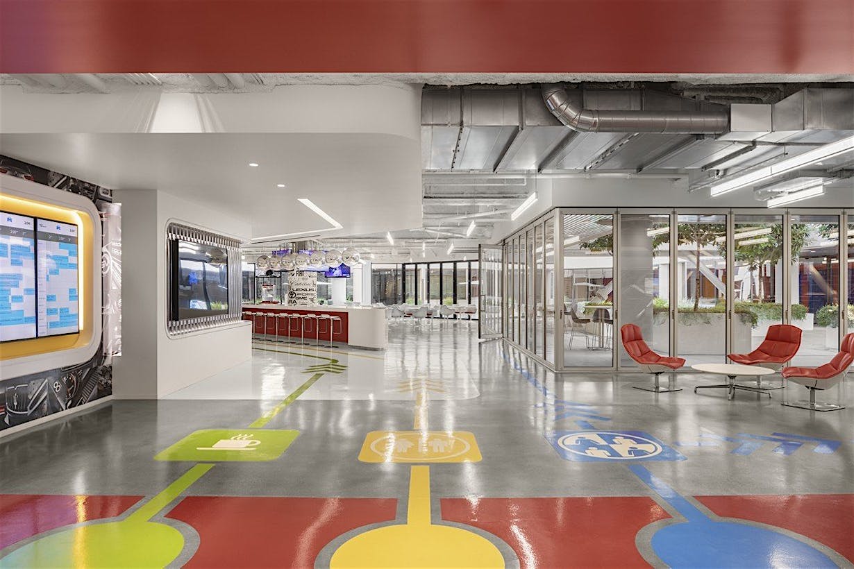
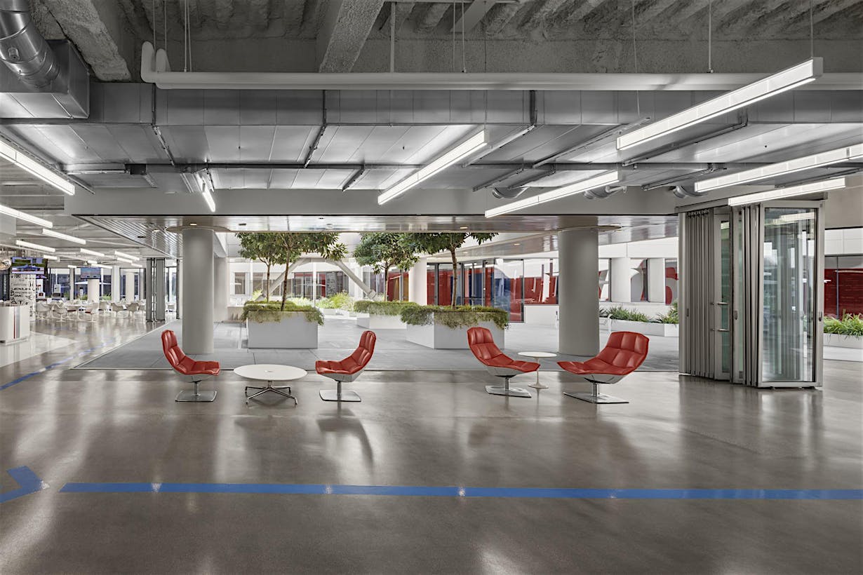
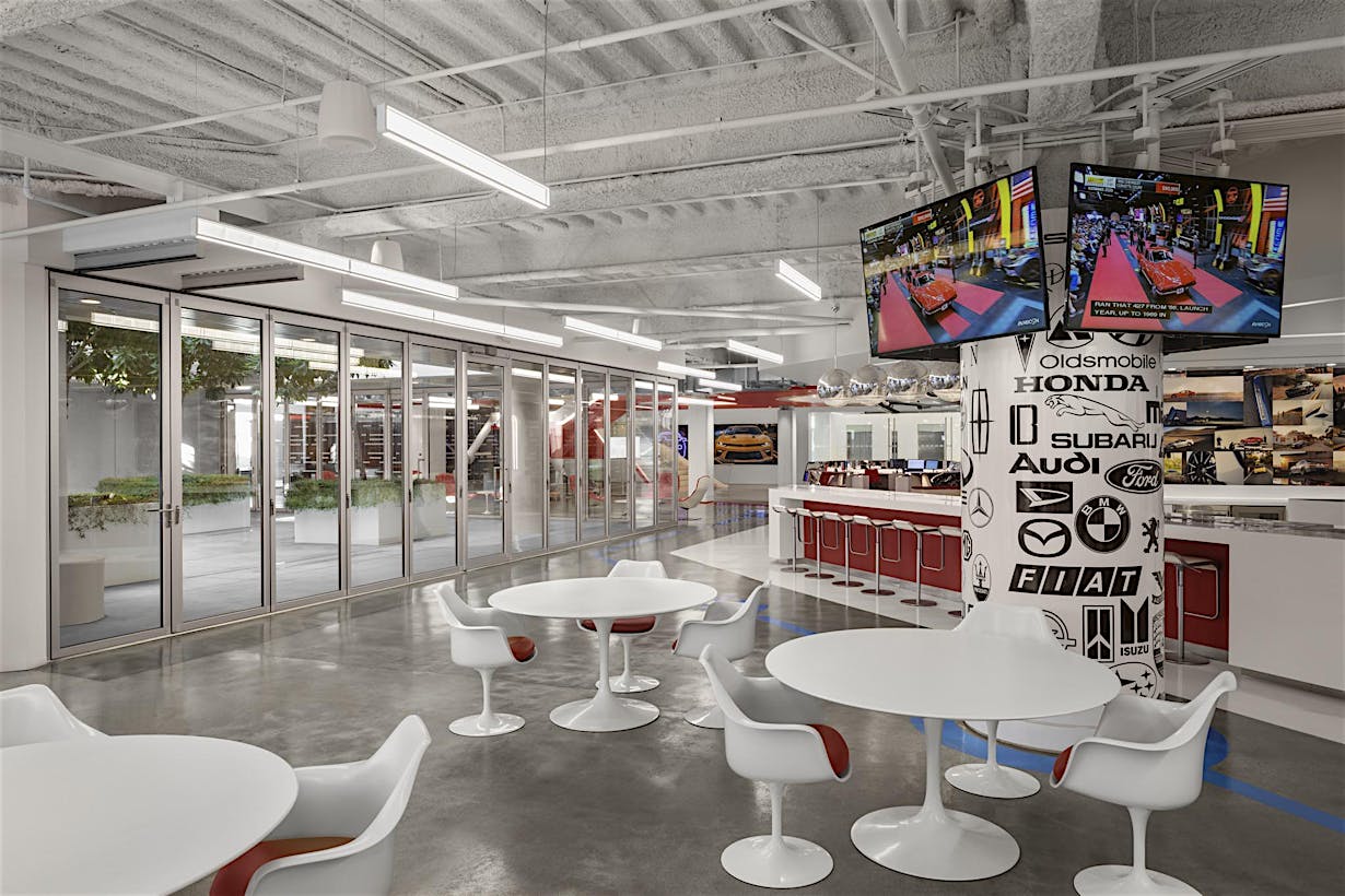
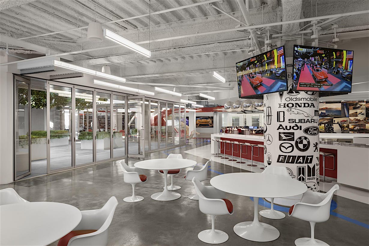
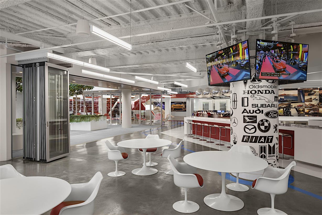
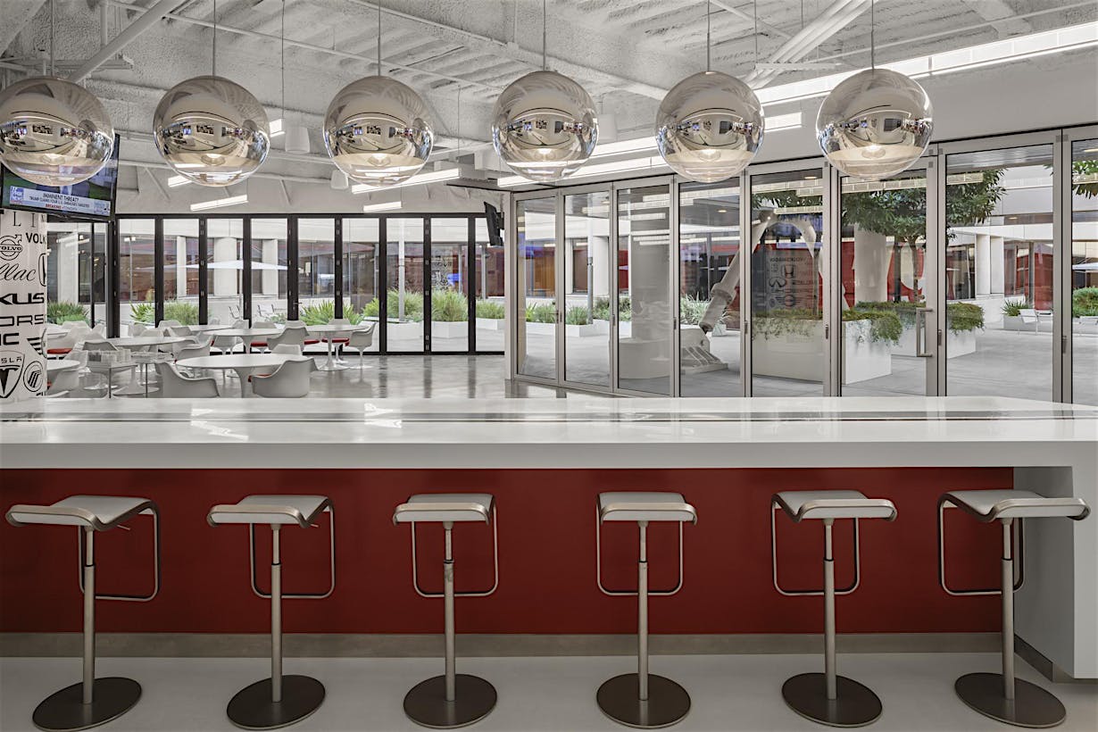
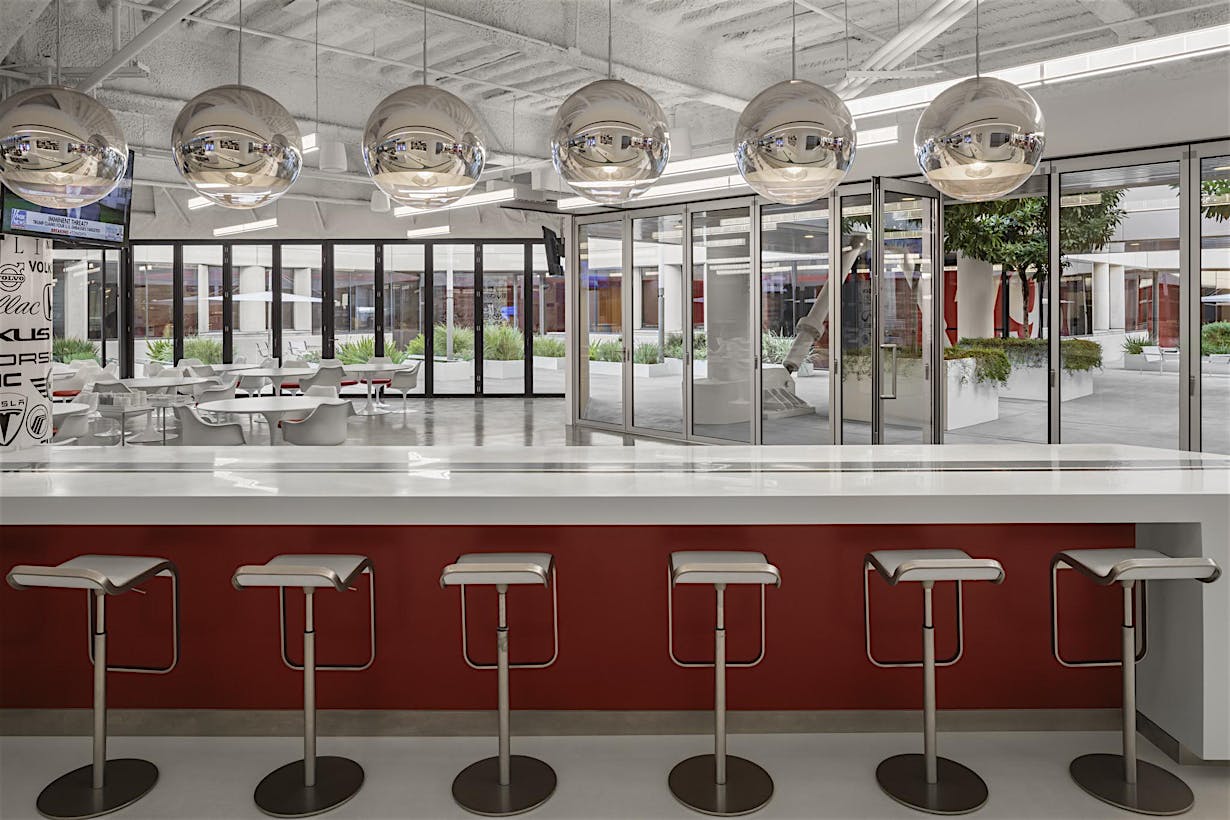
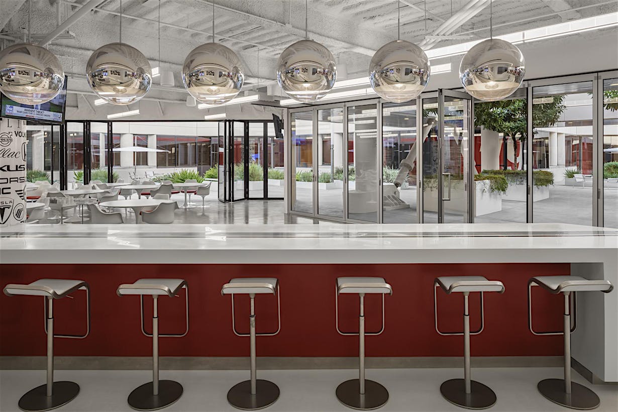
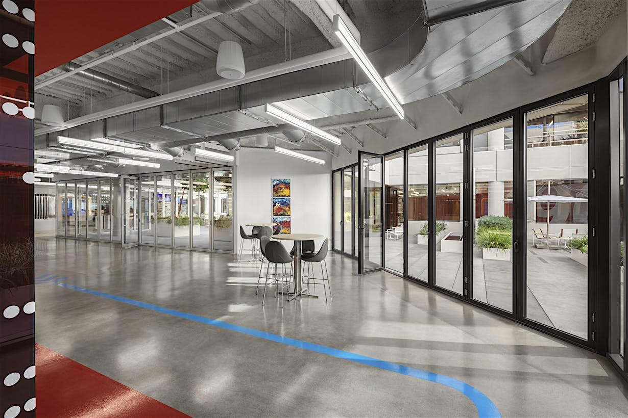
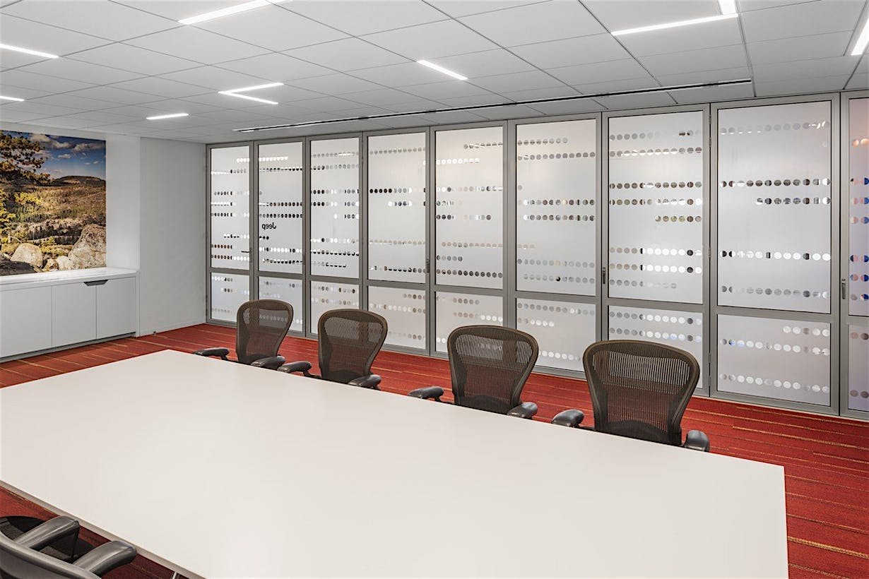
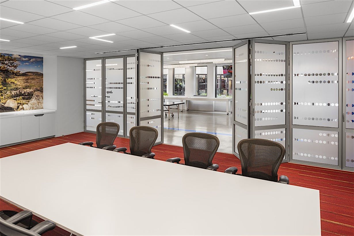
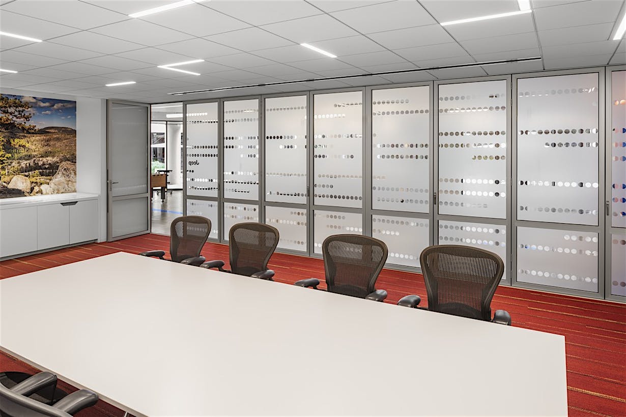
To open up the ground floor break room area, 36 panels were installed with a total linear run of 107’ and a height of 9’ 3” tall. The panels move centrally from the front and symmetrically to each side and stack conveniently outside the plane of the opening in custom designed parking bays. These panel parking bays are installed remotely and out of the way of the seating and tables. Additionally, the system has a no floor track option that was used to create an uninterrupted floor expanse. This flowing, threshold-free transition between the break room and the atrium accentuates the floating nature of the “Cloud” above. Small embedded floor sockets are used to lock the panels securely into place when the system is closed.
Total Flexibility
When needed, the closed system’s thermally broken panel design and insulated laminated glass provide not only a warm barrier but also the acoustical buffering needed in this office environment—all while reinforcing the overall translucent design intended by the architects. For traffic flow and convenience, the system is outfitted with four integrated swing doors that glide out of the way with the rest of the panels when the system is opened. The engineering of the self-guided wheel technology makes the panels easy to move with a single hand.
Now the fully completed DEG campus headquarters is home to two bridged modern office buildings that embrace natural light and transparency. The enhanced designs promote connectivity and interaction with the outdoor spaces creating one truly transcendent yet fully flexible and functional cloud-like sculpture center stage.
