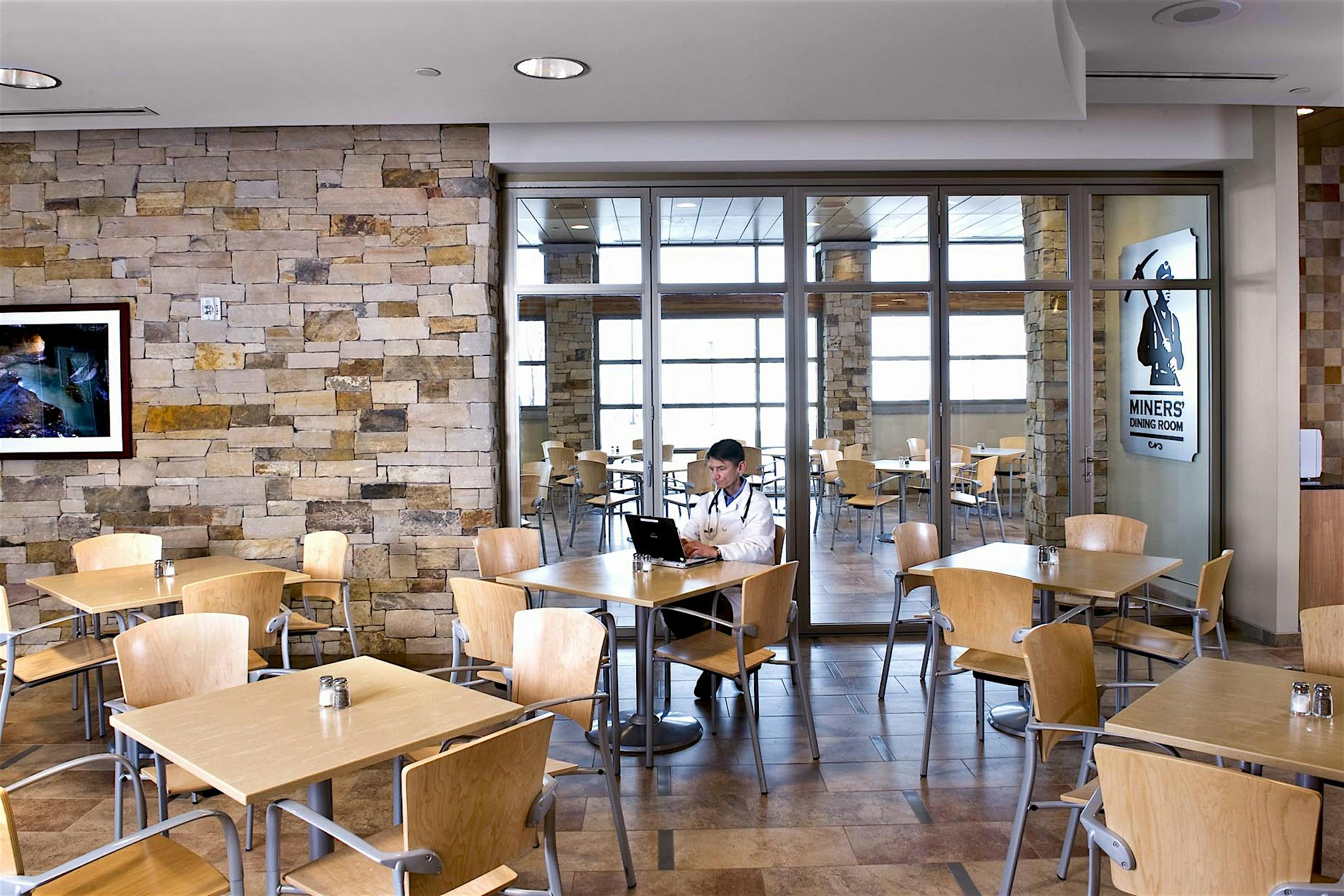
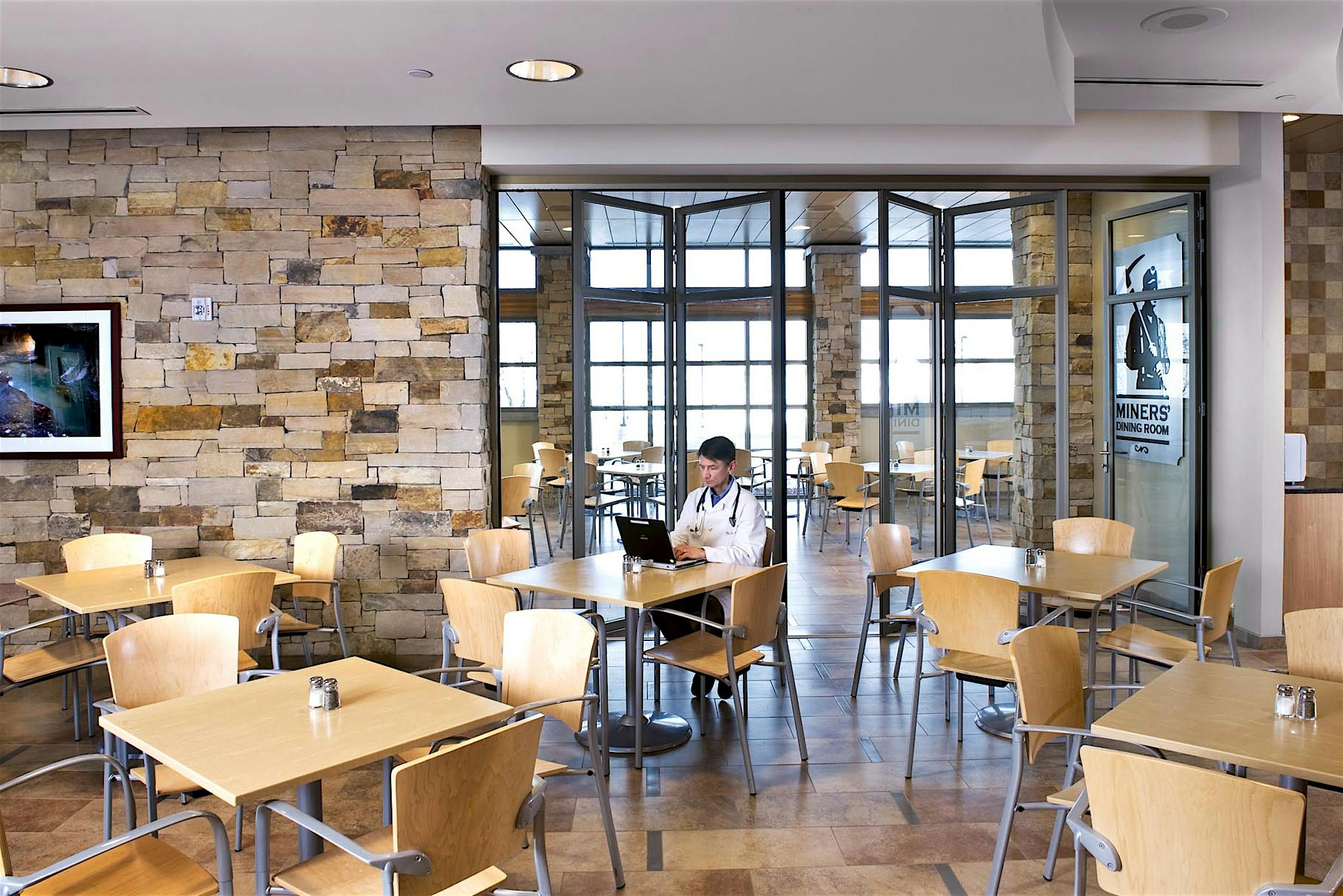
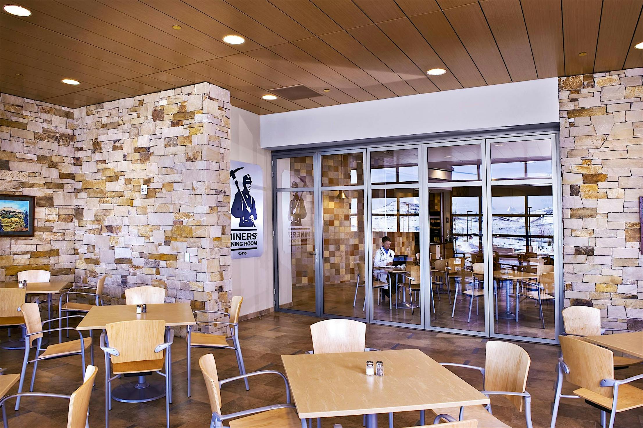
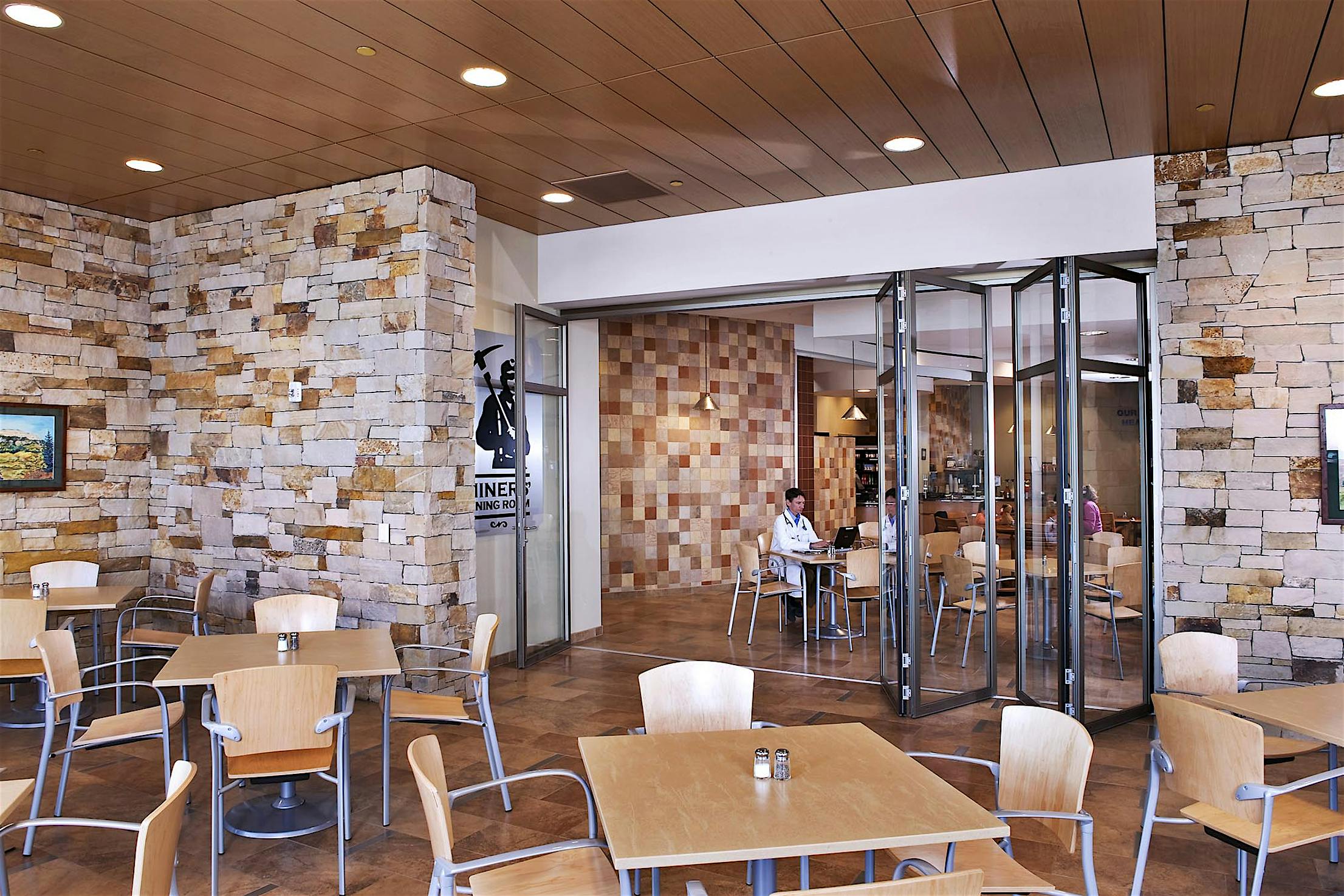
Park City, Utah, once a mining town-turned-ghost town, has become a resort area doing a half-billion dollars in tourism business annually since redevelopment began in the 1980s. No longer a ghost town, the city needed a new hospital, and Intermountain Healthcare decided to build one that would capitalize on the region's new resort character and breathtaking mountain setting while celebrating the long-ago mining heritage -- and delivering world-class care. Karen Cahoon, an interior designer working at that time for Architectural Nexus, which designed Park City Hospital, specified a NanaWall installation for the Silver King Cafe, Park City Hospital's cafeteria, with Intermountain's hopes in mind.
Park City Hospital
Creating a Multifunctional Space
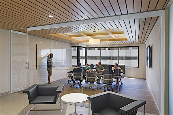
"The client wanted a flexible cafeteria solution," says Cahoon. "For most days and hours, the space would need to feel open and undivided. But when needed, a portion of the space would need to be closed off for private functions — meetings, private dinners for individual patient's families, and other such events."
Intermountain wanted as many parts of the hospital as possible to feel welcoming and warm, especially for those facing long-term care situations.
“The NanaWall system was ideal for a health care cafeteria setting, The flush floor track of the top-hung system eliminated any potential tripping hazards, and provides unhindered wheelchair access.”
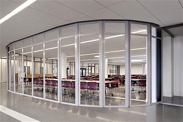
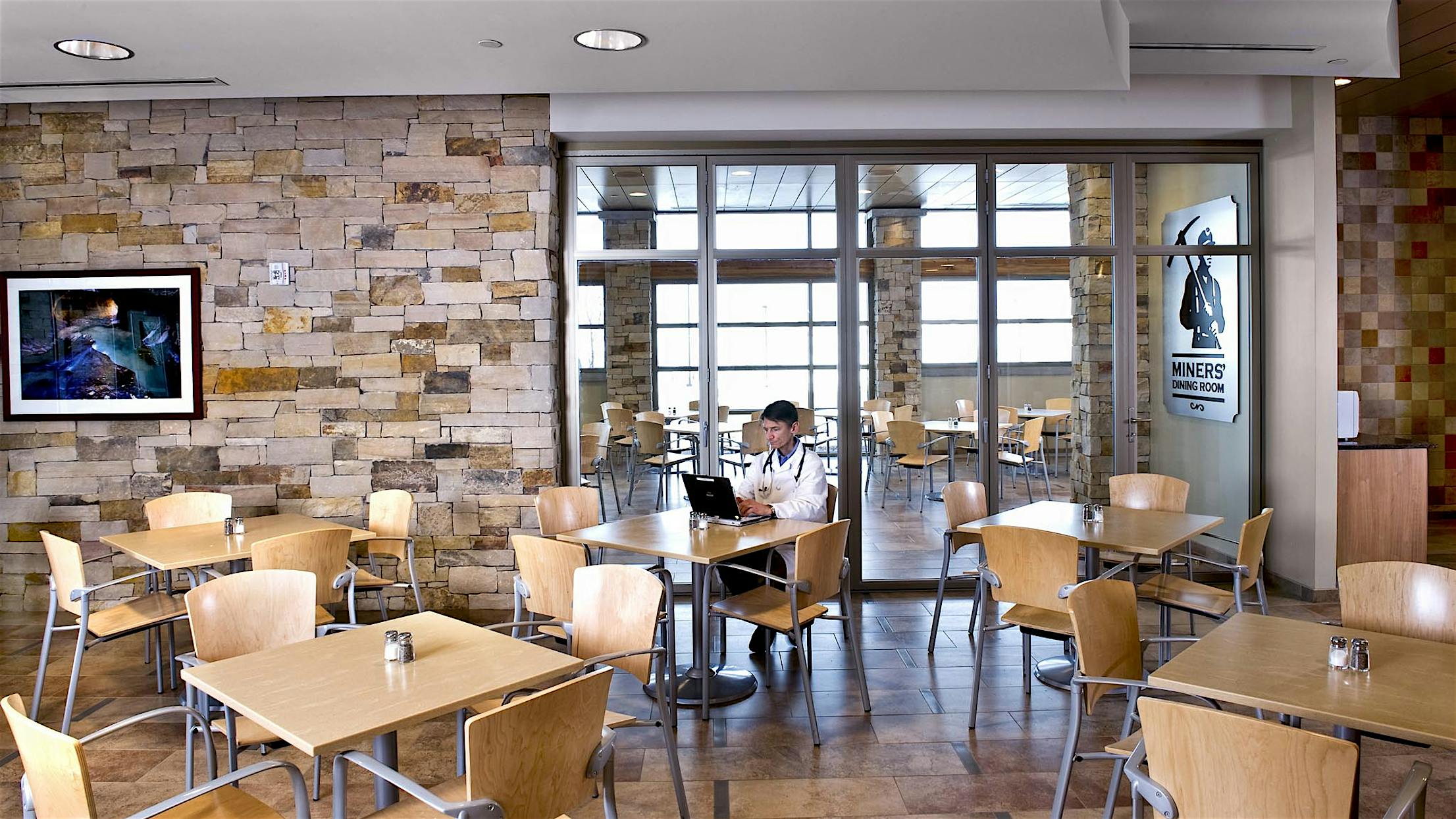
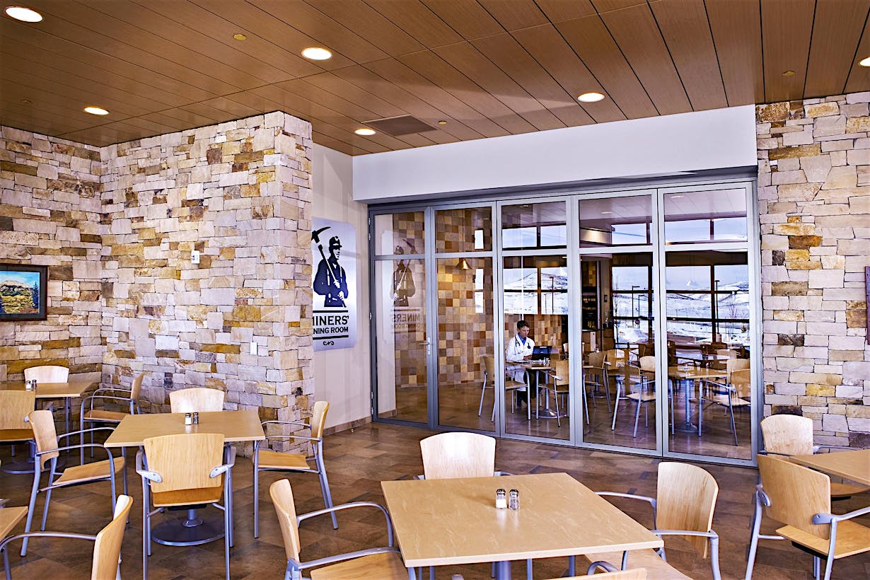
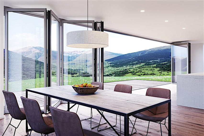
"The ideal solution would also allow for a reasonably unobstructed view, when closed, of the surrounding natural beauty of Park City's mountains," adds Cahoon. The design team specified NanaWall's SL45 Aluminum Framed Folding System with paired panels to achieve these goals. "While some systems could meet some of the client's expectations, few could meet them all, as NanaWall did," recalls Cahoon.
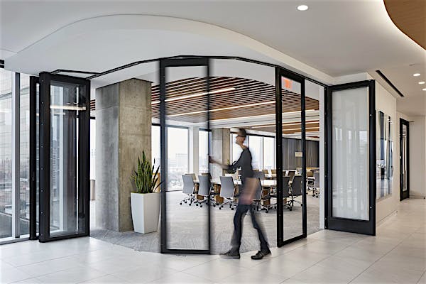
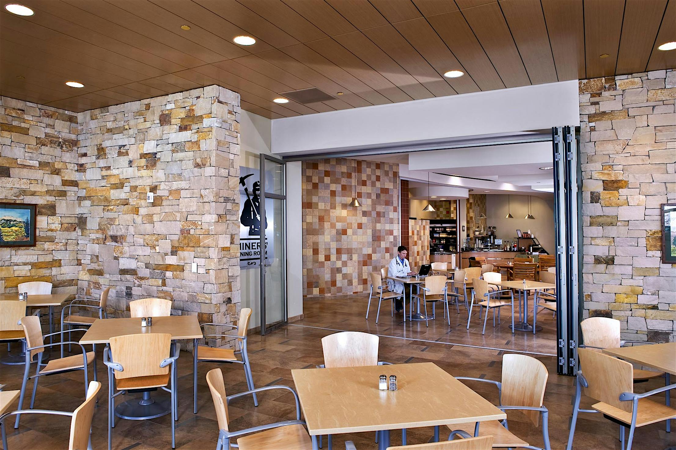
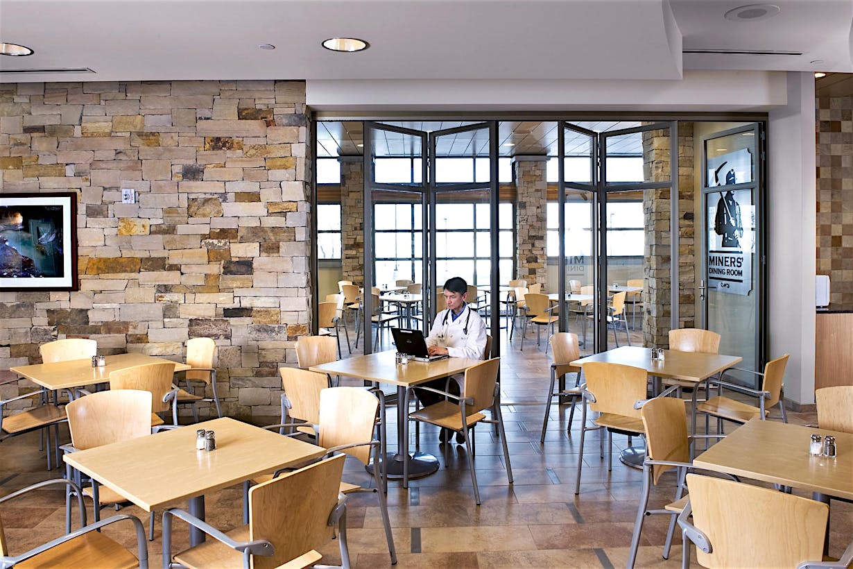
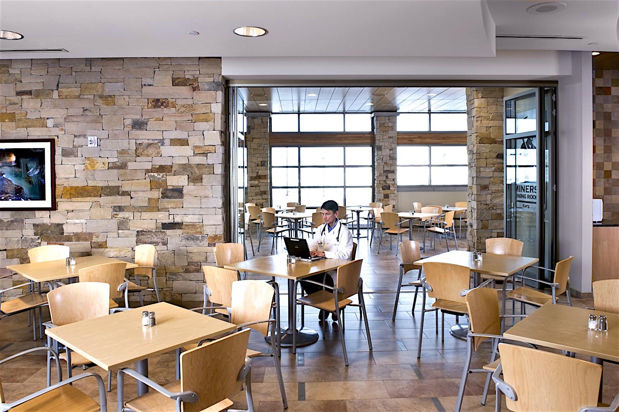
Four of the five top-hung panels are configured as bi-fold paired panels, and the fifth is outfitted with typical door hardware for operation as a door when the system is closed. Staff, patients and visitors seated on the interior side of the system enjoy minimally obstructed daylight and exterior views from the floor-to-ceiling glass of the cafe's exterior wall. When open, the two seating areas appear to be one.
"The client and I were probably most happy with the fact that the system practically disappears when fully open," notes Cahoon. However, the design team also had to be mindful of the particulars of design for health care facilities. NanaWall's system construction and engineering were helpful in this regard, as well.
Well Suited for Health Care Environments
"The NanaWall system was ideal for a health care cafeteria setting," continues Cahoon. "The flush floor track of the top-hung system eliminated any potential tripping hazards, and provides unhindered wheelchair access."
"The system is also relatively easy to clean and maintain," she adds, noting that this is an important consideration for both food service and health care applications.
A Wide Range of Finish Options
"Furthermore," she continues, "the range of available finishes allowed us to integrate the system seamlessly by matching window mullions and other architectural elements." When closed, the panels not only appear to be integrated architecturally, but they also provide acoustic attenuation, making the 'Miner's Dining Room' an effective private space for meetings and events.
"I have designed a number of cafeteria settings for health care projects," Cahoon says, "and I am particularly proud of Park City Hospital. The project won a regional health care design award from the IIDA Rocky Mountain Chapter." Moreover, the combination of the excellent interior design and the addition of a well-respected chef has done something rather unheard of: it has turned a hospital cafeteria into a local dining destination.
Cahoon concludes, "The NanaWall system certainly contributed to the project's great success."
