The majestic 1888 stone-walled Culinary Institute of America - also known as CIA Greystone - is one of Napa Valley's most historic properties. It epitomizes the area’s rich food and wine heritage, and also promotes organic ingredients and al fresco dining. Only 20 miles down the road, in downtown Napa, resides a much more accessible, but no less gourmet venue for the Northern California lifestyle: Whole Foods.
Whole Foods Napa
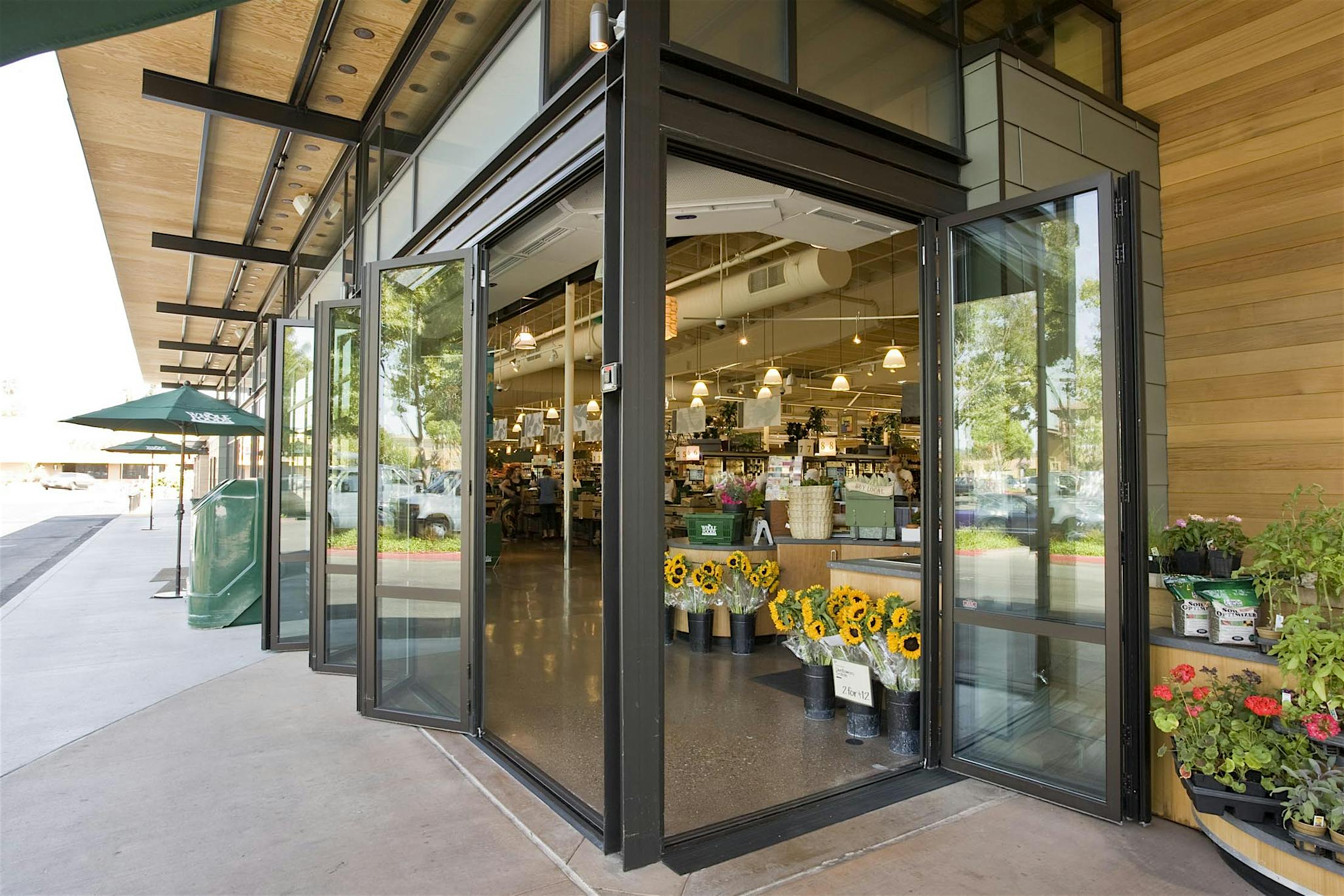
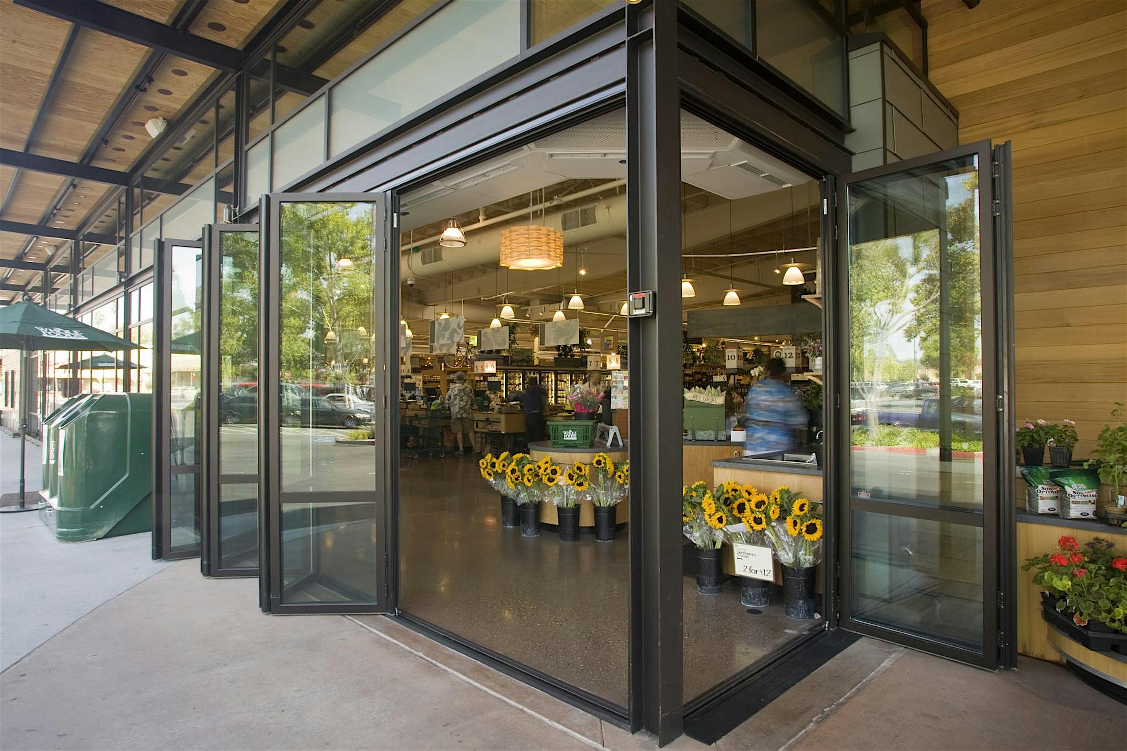
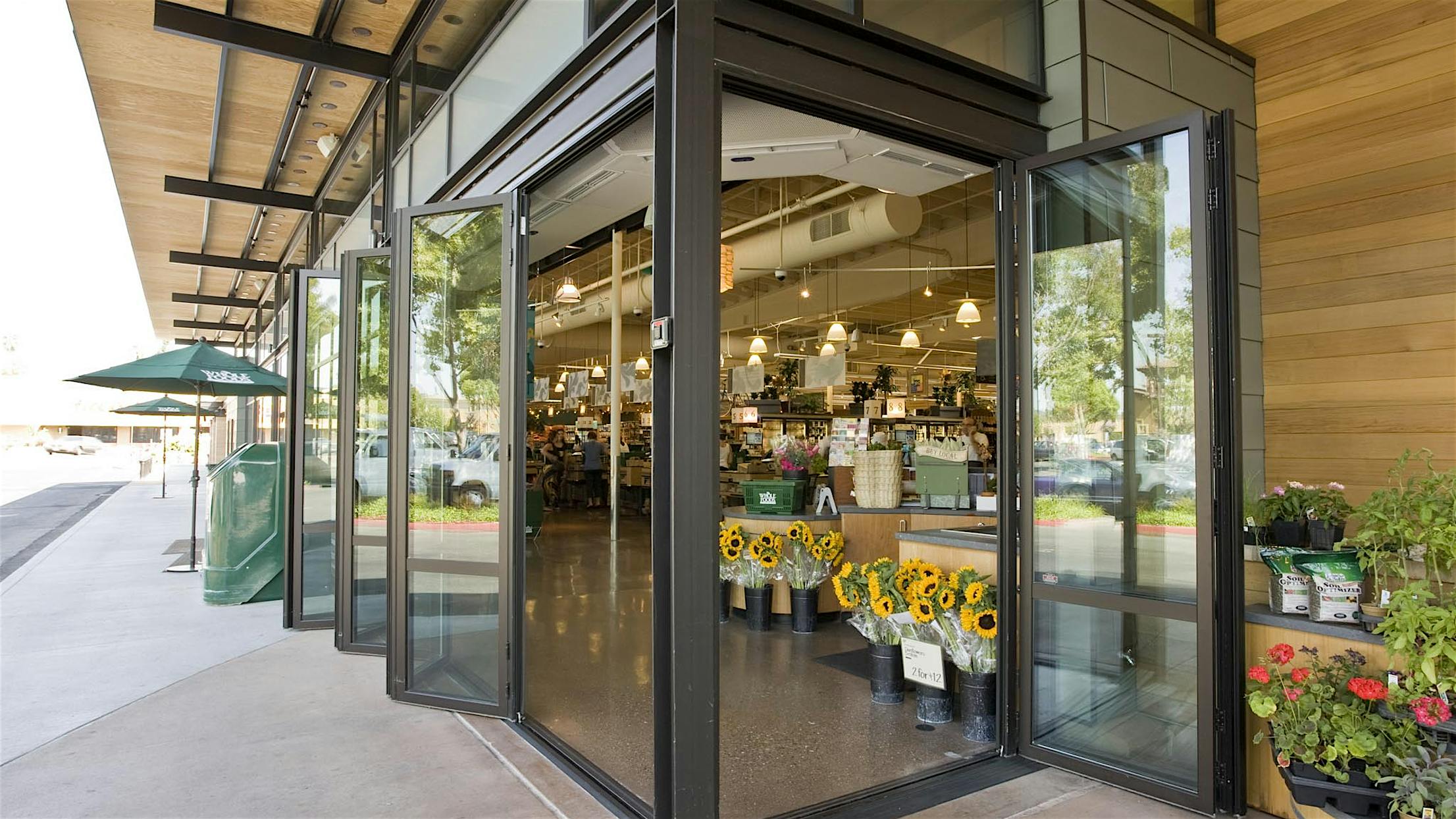
At almost 50,000 square feet, this was the first Whole Foods Market to open in Napa. The store includes a much-needed update to the existing shopping center aesthetic. Field Paoli, the San Francisco architecture firm, designed this modern Arts and Crafts façade, which includes a wood and steel canopy pop-out over the entrance, stone pillars and store windows with traditional Mission glazing.
Creating an Open Market Appeal
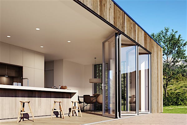
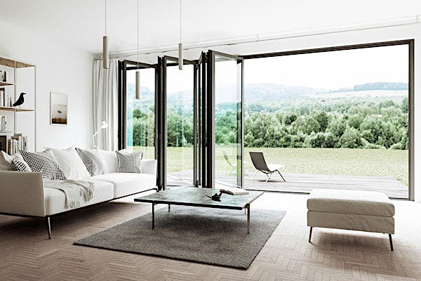
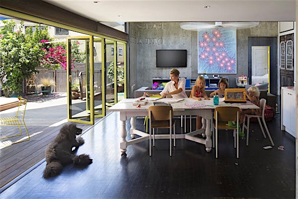
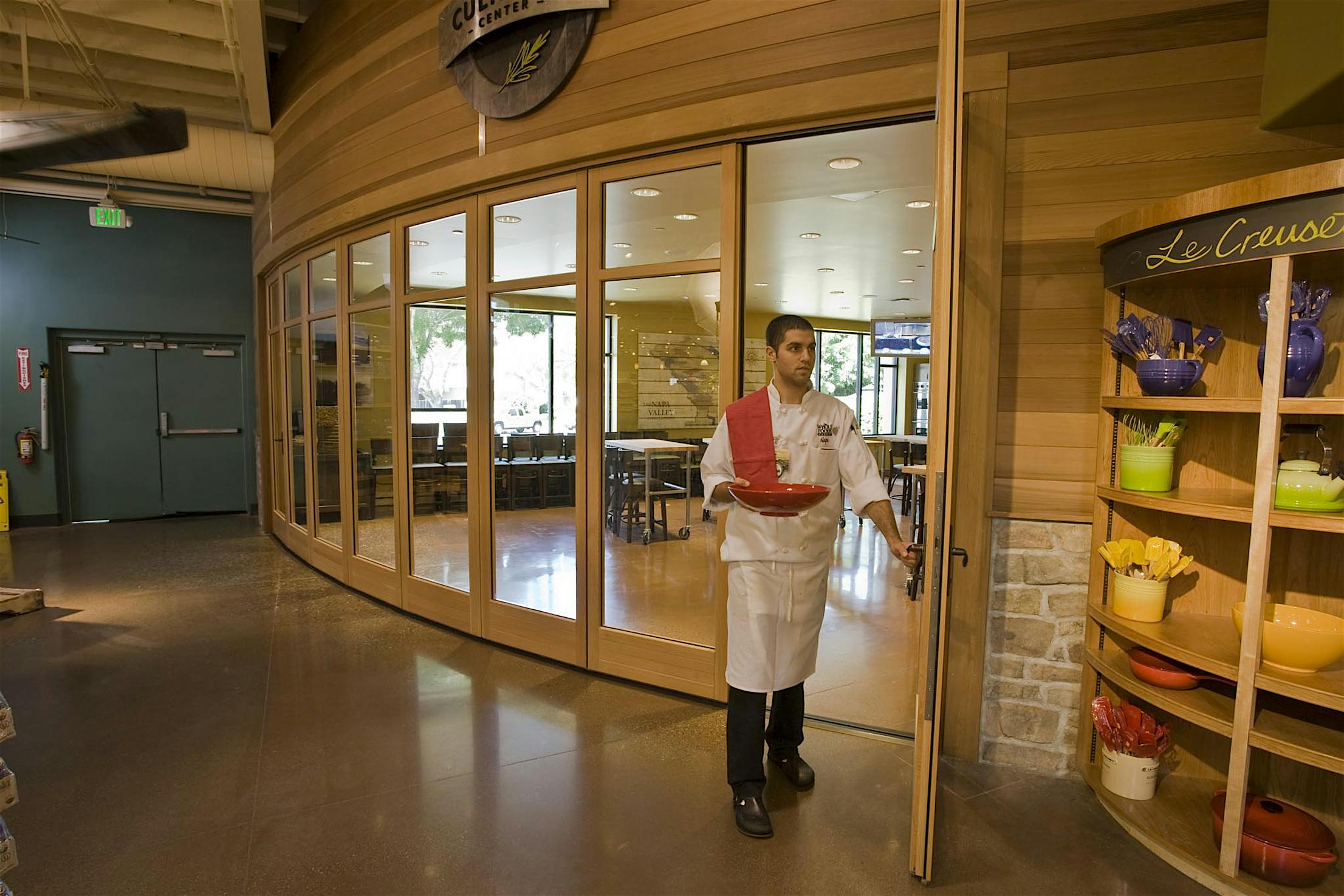
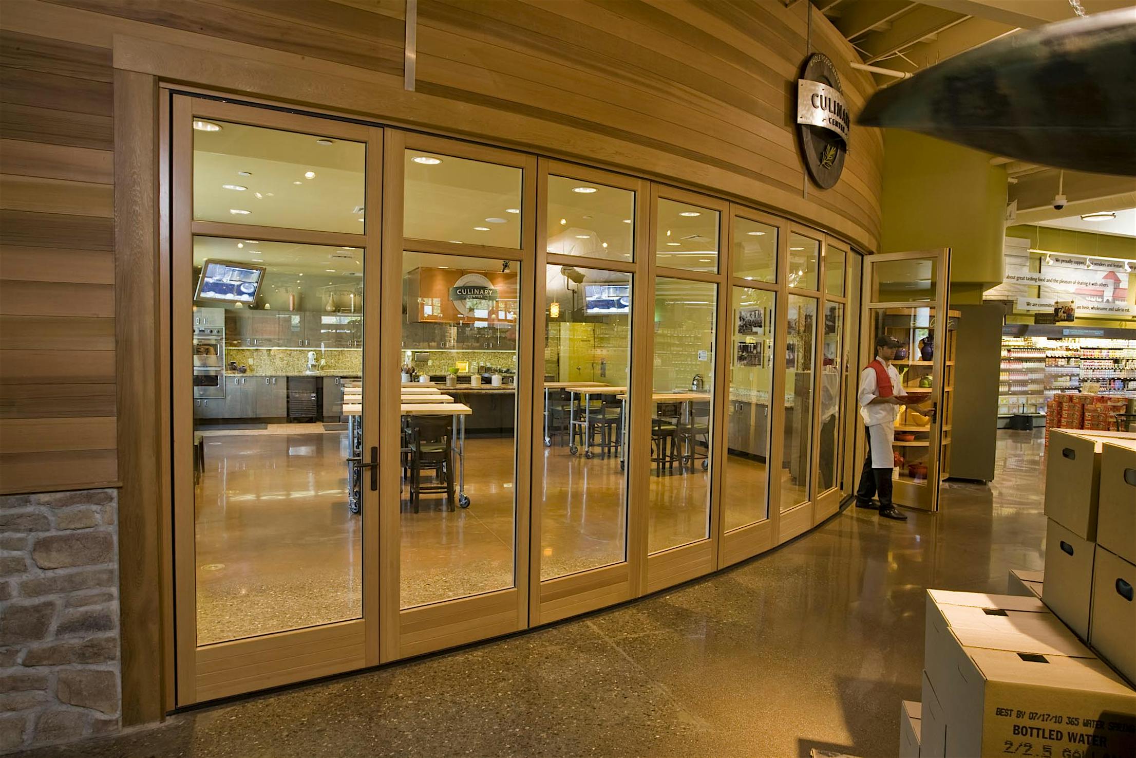
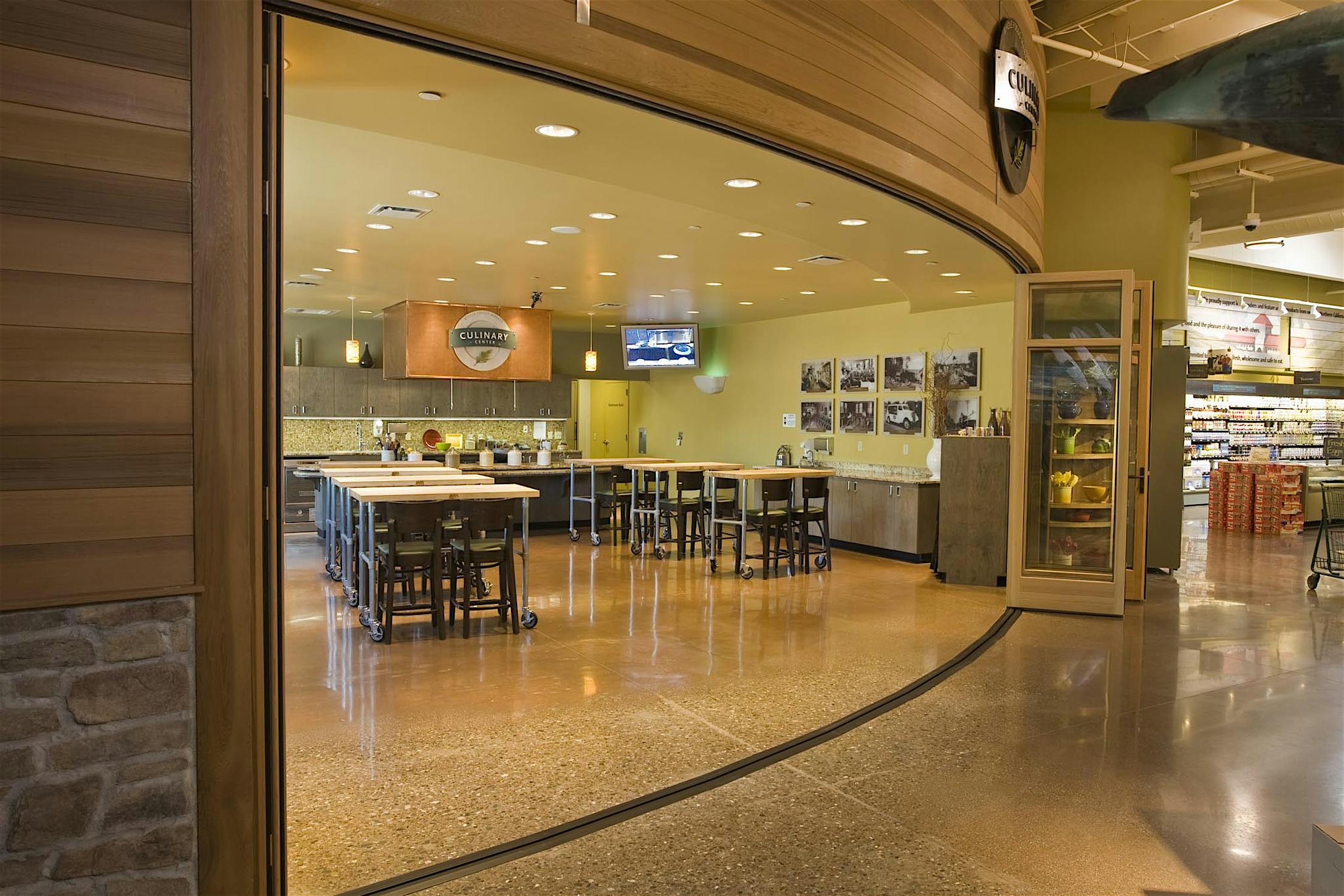
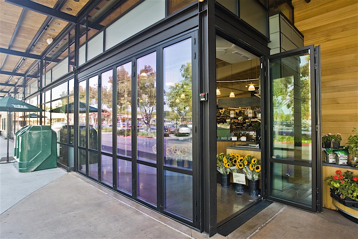
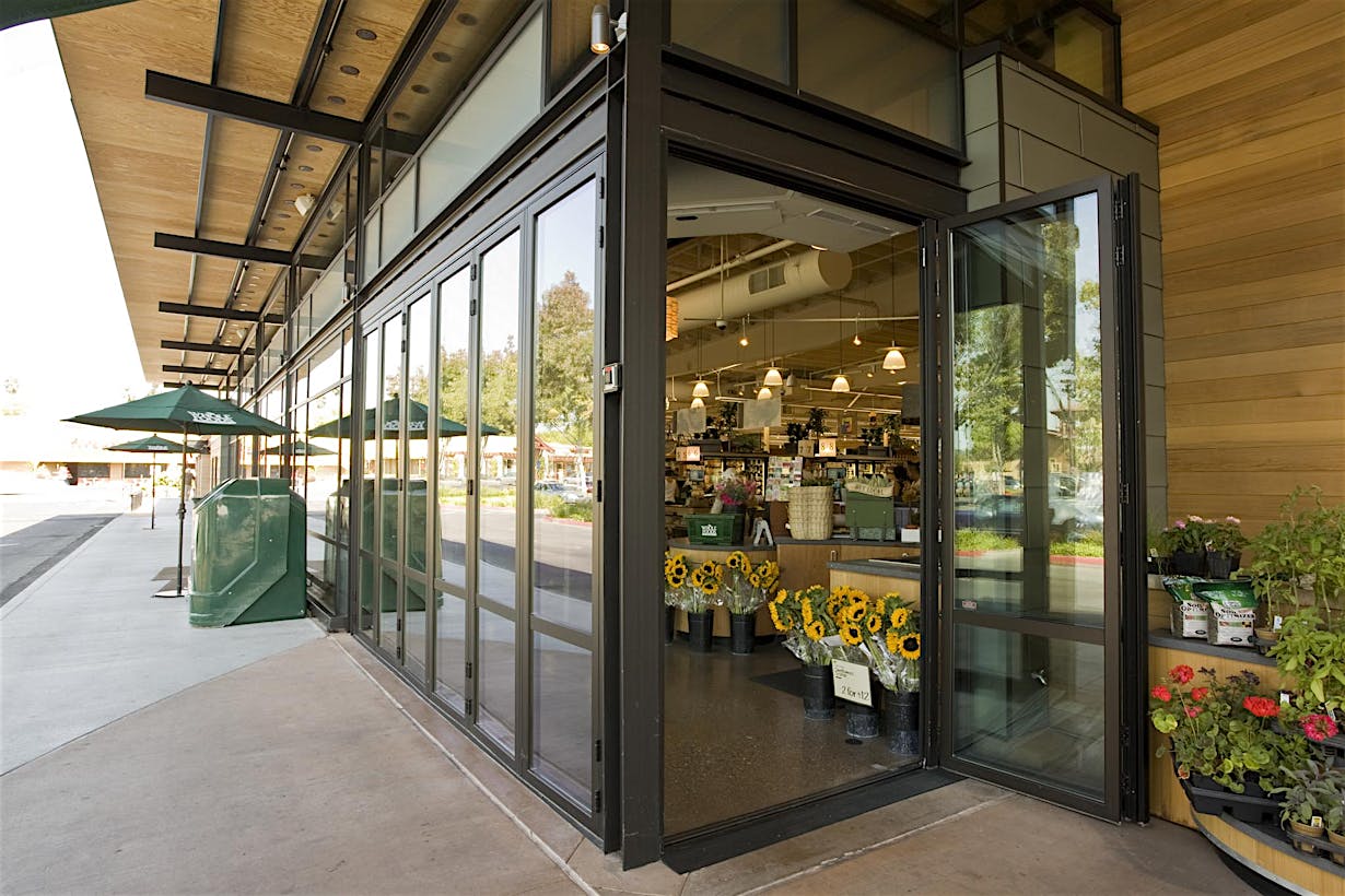
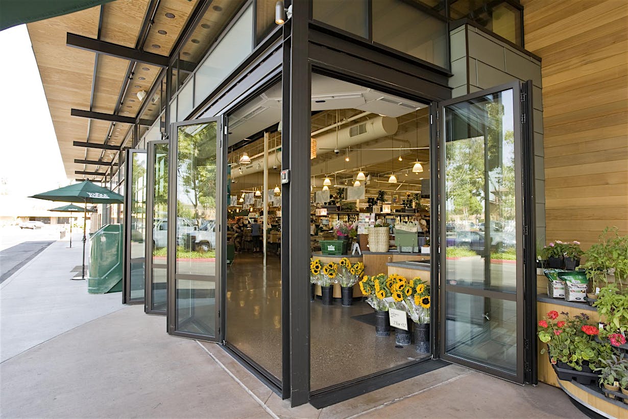
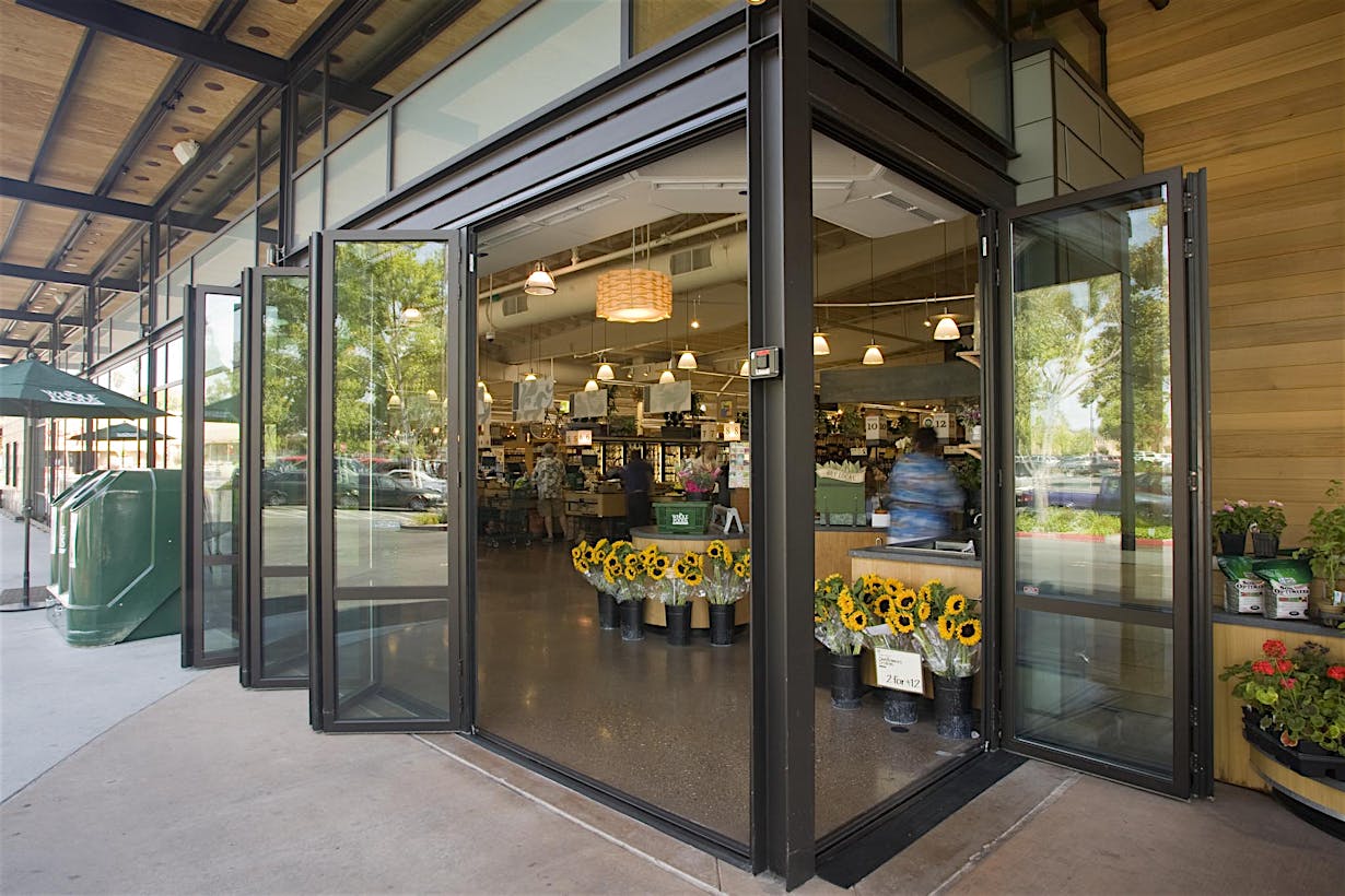
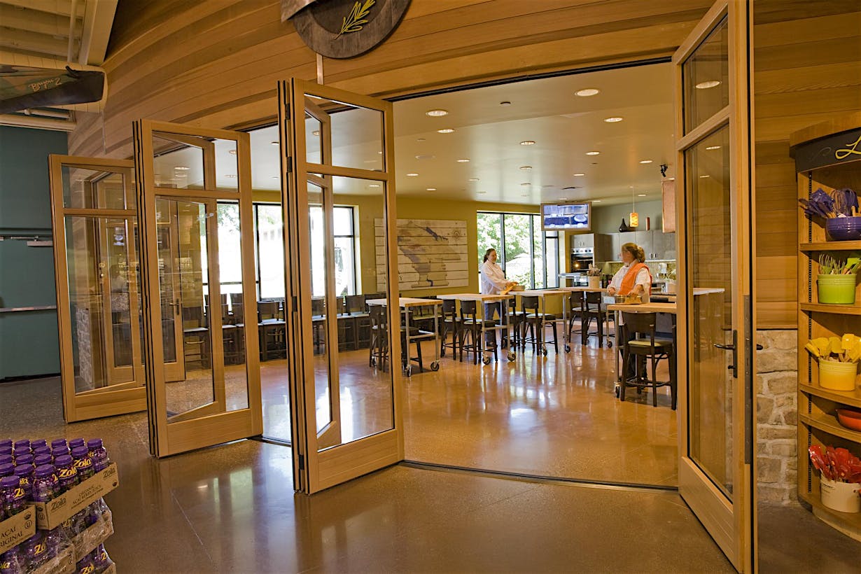
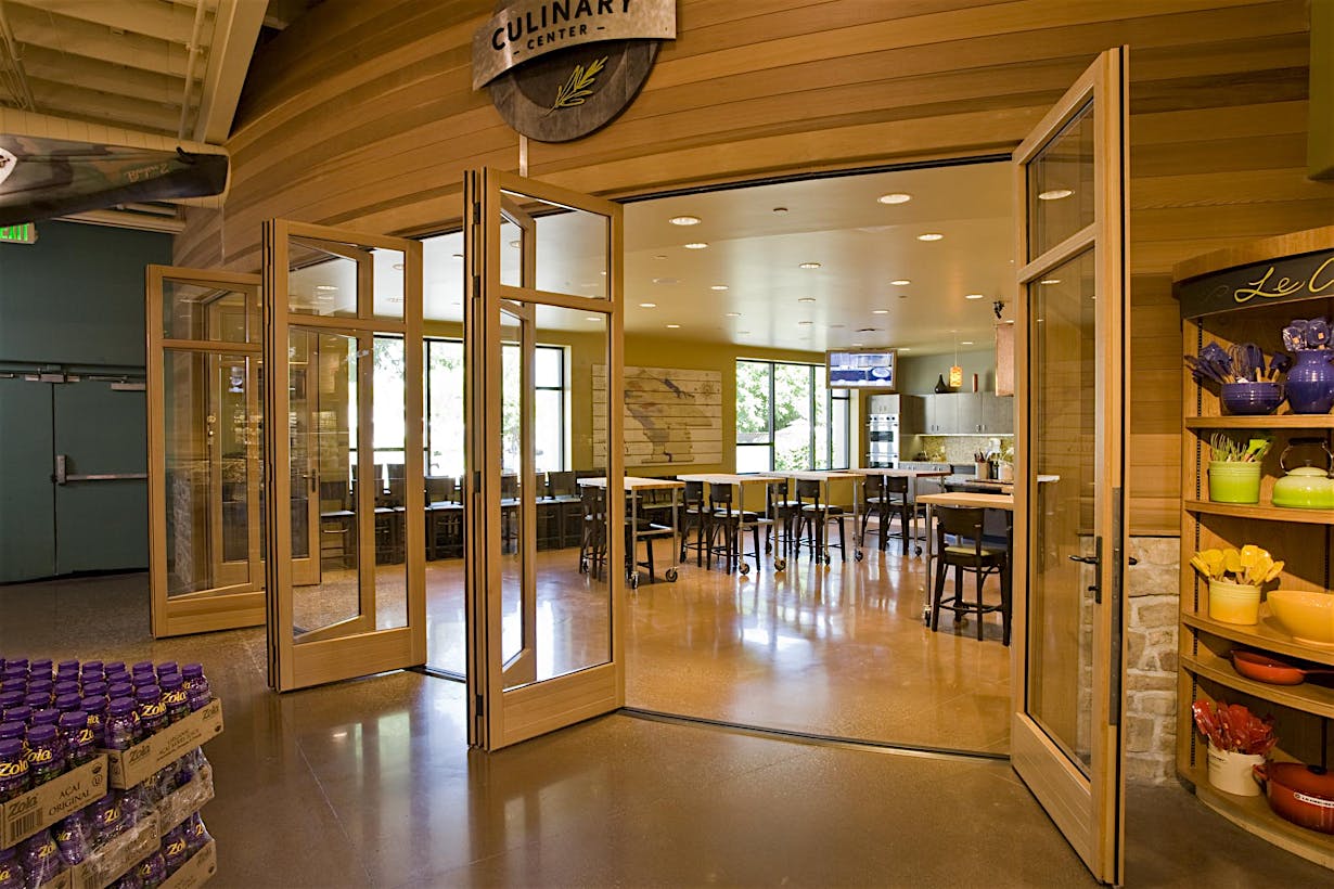
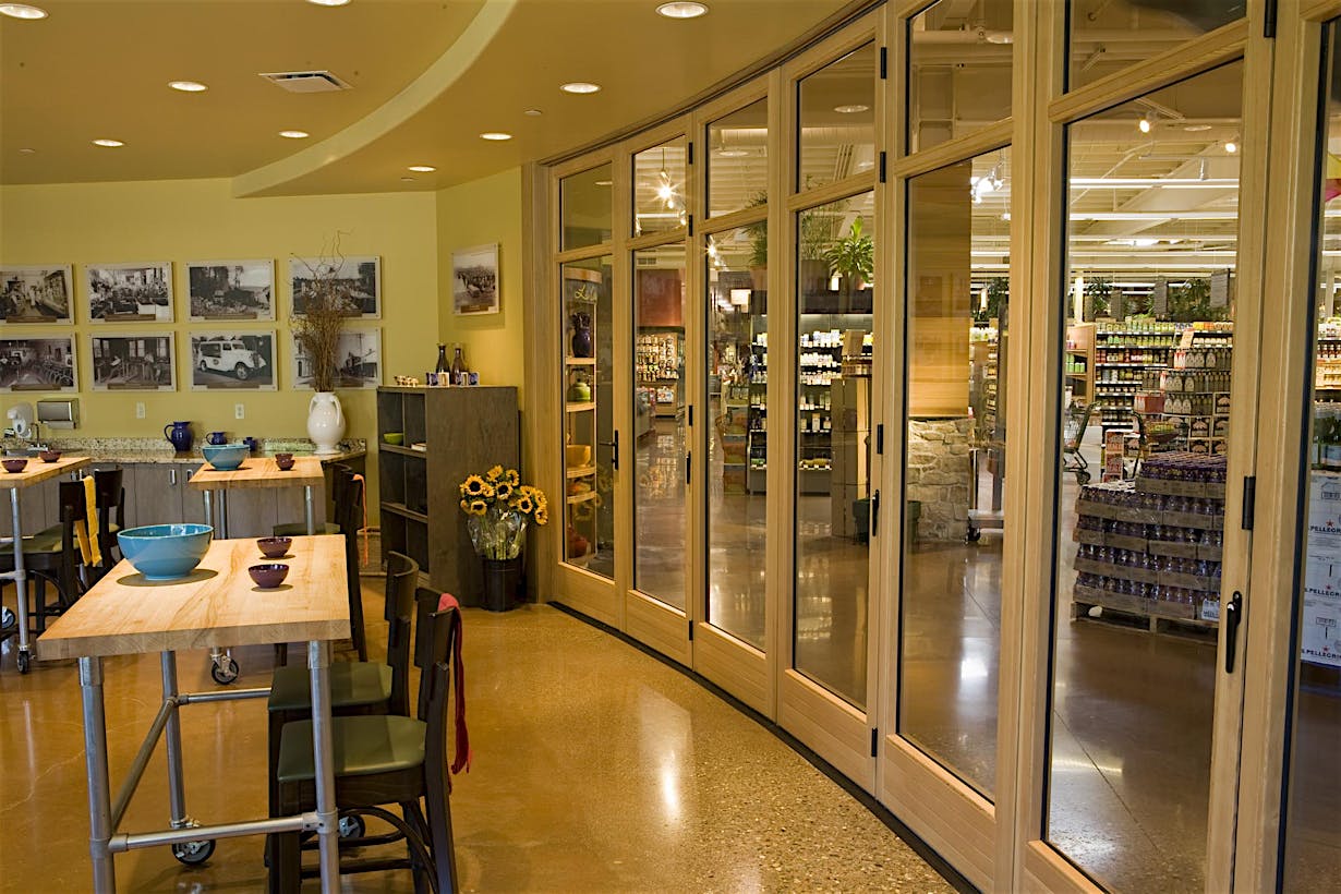
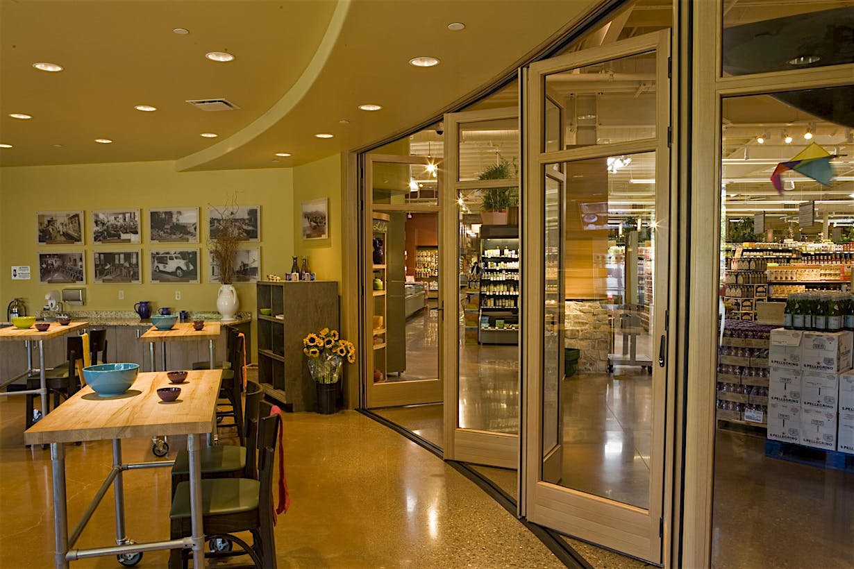
Whole Foods Napa features a wine bar, culinary center, sushi bar, an open grill, and a full-service coffee bar with an outdoor walk-up window. The culinary center, in particular, is the embodiment of the Napa indoor/outdoor experience in part because of its NanaWall opening glass walls.
“At the Whole Foods Market Culinary Center, the design team wanted the flexibility of allowing the space to spill out into the sales floor or to be closed off for private events,” says architect Christen F. Soares of Field Paoli. “NanaWall provided the solution. NanaWall was instrumental in allowing us to create the casual feeling of indoor/outdoor living that reflects the values of the Napa community.”
“NanaWall Provided the Solution. NanaWall Was Instrumental in Allowing us to Create the Casual Feeling of Indoor/Outdoor Living That Reflects the Values of the Napa Community.”
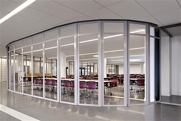
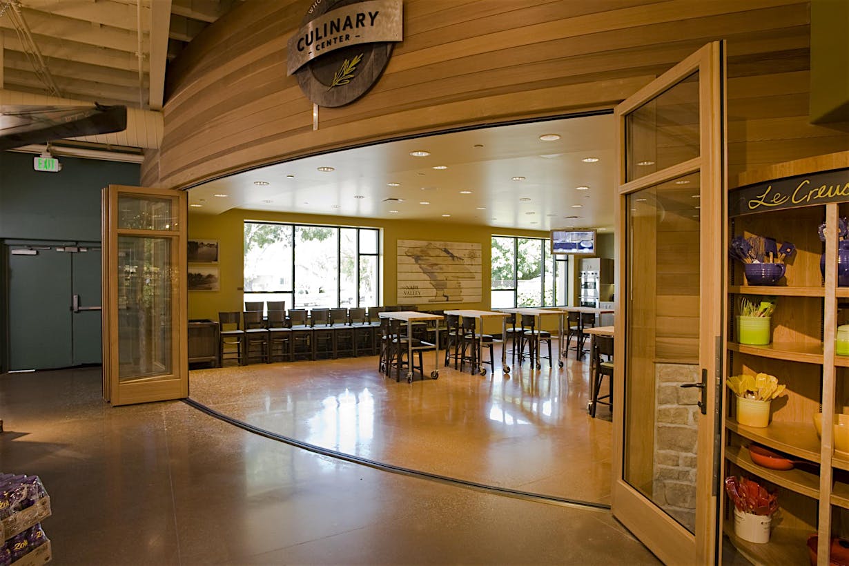
The semi-circular entrance was made possible because of NanaWall’s many custom options. The wood and curvilinear design is welcoming. Soares elaborates on this: “When open, the NanaWall glass wall system allows the floral displays to spill from the inside to the outside, providing a colorful, inviting entry.”
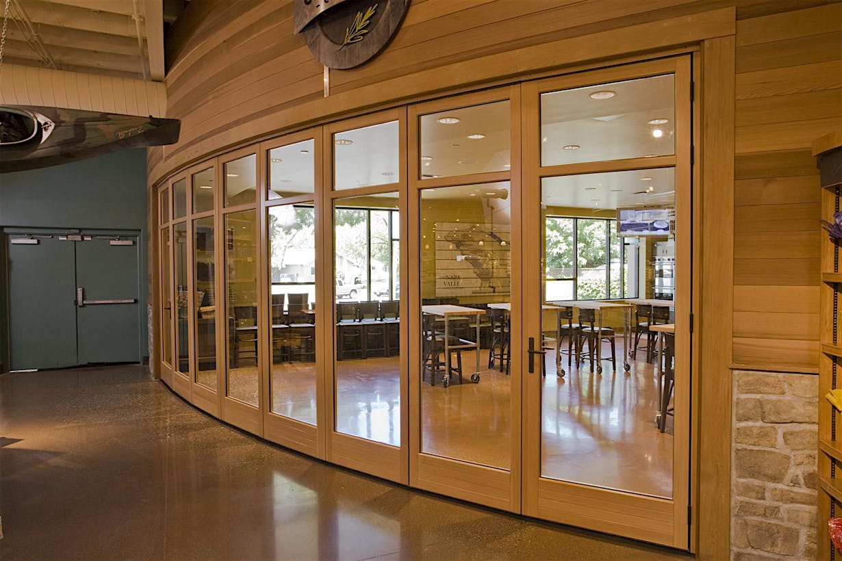
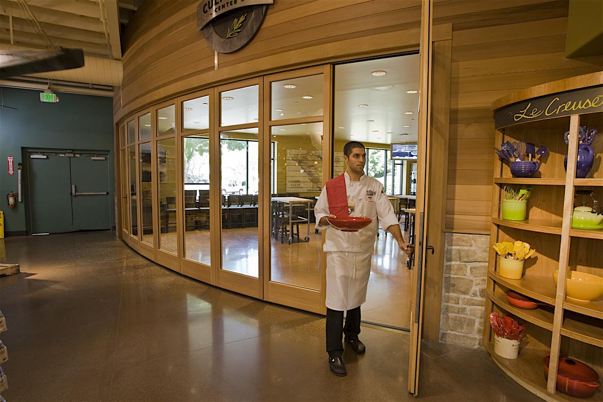
The Culinary Center incorporates Arts and Crafts aesthetics, too. “The design teams' goal,” according to Soares, “was to create a warm and inviting indoor/outdoor environment that celebrates Whole Foods commitment to quality and the rich heritage of this world-renown agricultural area.” They accomplished this with the NanaWall; the aluminum frame is triple laminated with a golden wood veneer. Similar colors appear on the wall boards and mortared wall.
Field Paoli added other traditional elements. The transom mullions and extra slats on the bottom of the doors illustrate this. Clever symbolism is apparent in the design of the header above the entrance. It bends and curves up, giving the illusion that the room is a threshing basket.
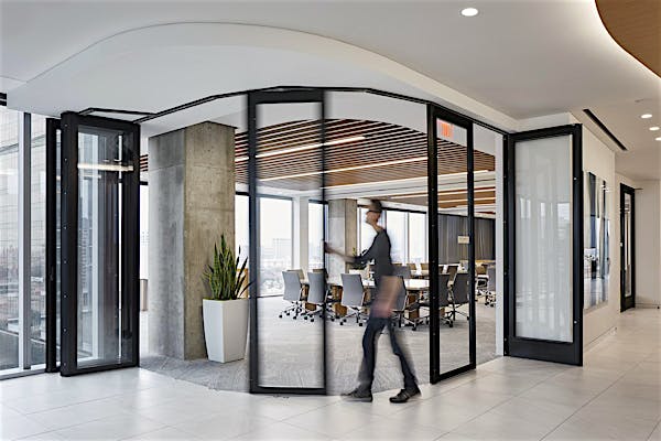
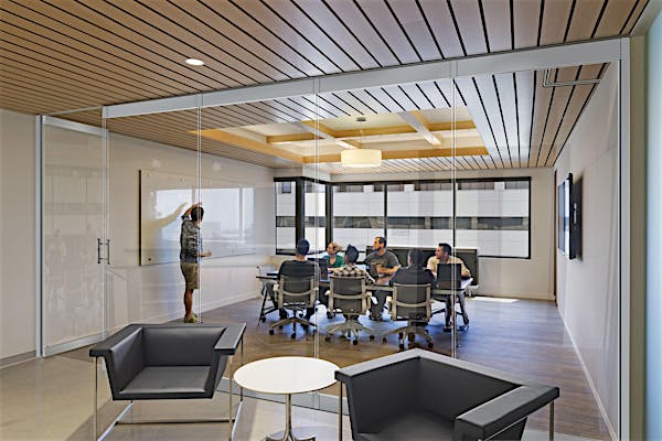
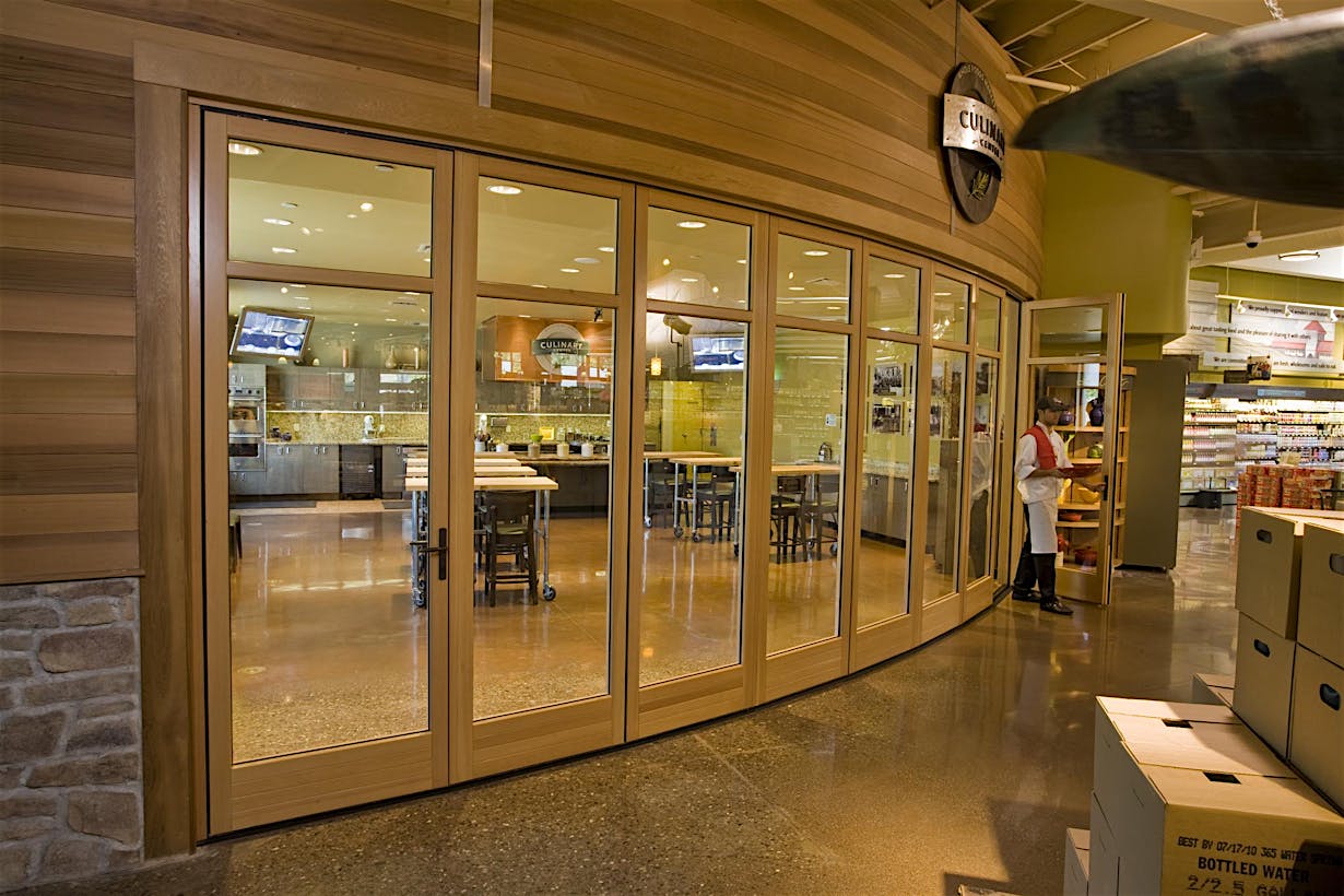
The staff at the Napa store loves the SL70 system because it makes the store unique. “The NanaWall that surrounds the Culinary Center creates a transparent barrier that allows us to close off that part of the store while creating interest in the space or the classes being taught,” stated Cindy Seyler from Whole Foods.
Sound Attenuating Interior Division
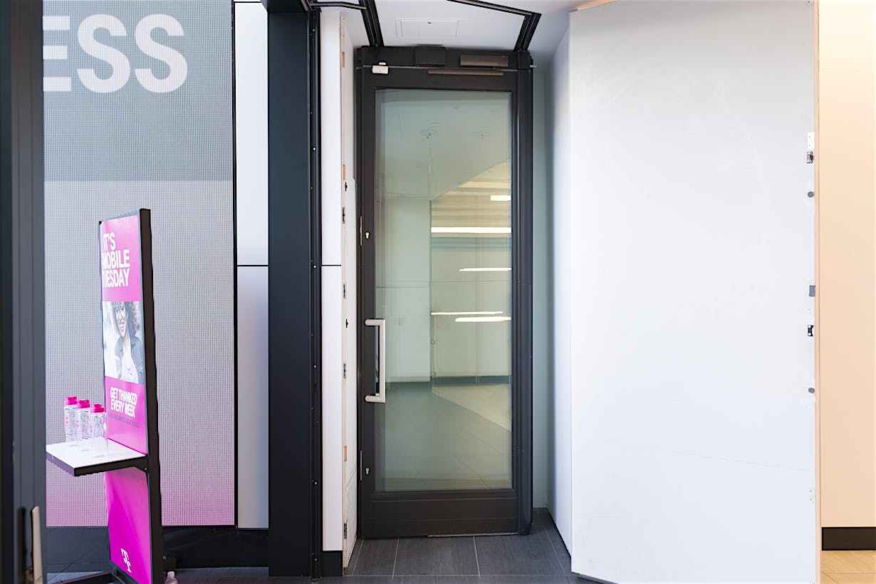
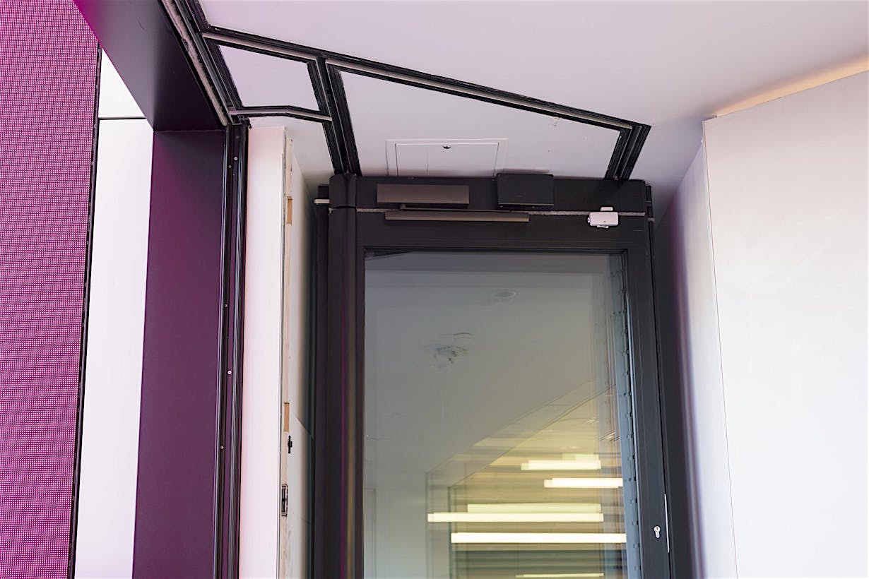
Seyler commented on the excellent sound attenuation qualities of the wall too: “The NanaWall also is great at keeping The Culinary Center quiet during the classes yet doesn't give the feeling that you are in a classroom.” This SL70 system also includes an independent swing door, allowing access in and out of the space, without having to fold and stack the entire unit.
The indoor/outdoor experience is unified with other design aspects. Both spaces share a stained and polished concrete floor—the joint lines imperceptibly interrupted by the NanaWall tracks. The wall unit provides lots of flexibility, and so does the classroom, with its preparation tables.
The Tuscan countryside colors in both spaces—yellows and oranges—are believed to stimulate a feeling of happiness and wanting to share. Clearly, the translucent NanaWalls do the same thing.
